Thanks goodness I had the foresight to ask a friend to come with me and we had the help of one of the young gals at the gallery pitching in. The Craig Gallery is a largish space – I took 13 quilts, 9 fibre art pieces, 5 floral pieces, and 22 of the 6×6 pieces. (I brought 2 quilts home with me).
Hanging an exhibit is always time consuming – walking into an empty gallery it’s hard to know where to start. I had visited during the summer so I knew more or less how many quilts I could hang on each wall, but still, deciding which quilt to hang where takes time. We arrived at 10:00am; finished at 2:50pm (with a half hour for some lunch and a large glass of water).
I still have work to do – there’s a spot for one more small piece (which will need a label) – I will take that with me Thursday before the opening begins and hang it then. There’s also a video screen outside the gallery which presents a slide show of what’s inside – I need to create a slide show of the quilts and other works and email that to the gallery.
Nevertheless, the exhibit is hung. While we were finishing up, people started coming in – the front door was open, even though the gallery was formally closed. We welcomed everybody who wanted to see the show.
I had fun explaining what they were looking at – if you’re not a quilter you have no idea what work actually goes into this kind of art. The question I’m always asked: “How long does it take to make one of these pieces?” I can calculate the “cutting, piecing, assembling, quilting, finishing” time – I can make a quilt in about three weeks. But how do I calculate the “thinking about it before you begin time, the collecting fabrics time, shopping for that last bit of colour fabric time, selecting thread colours time, creating the quilting design time, sleeping on it time, looking at it on the design wall time”? Incalculable.
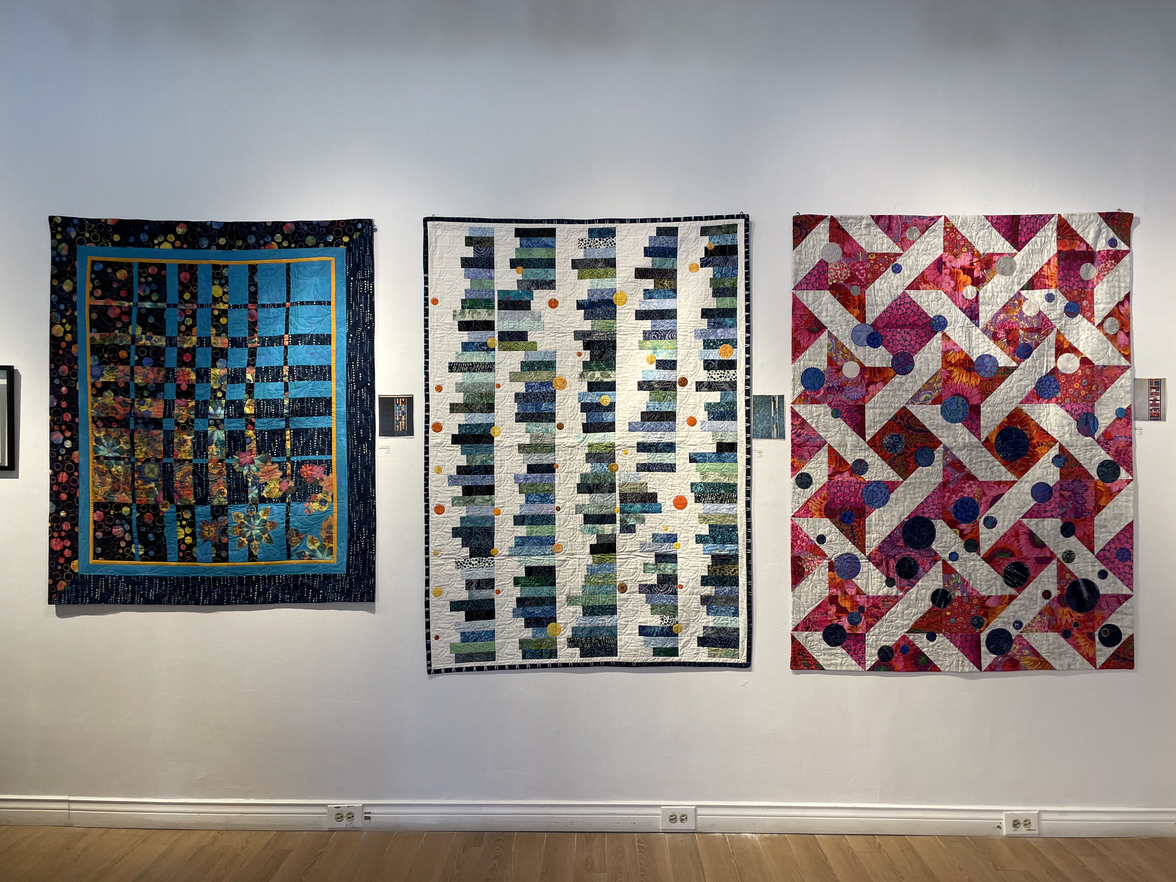
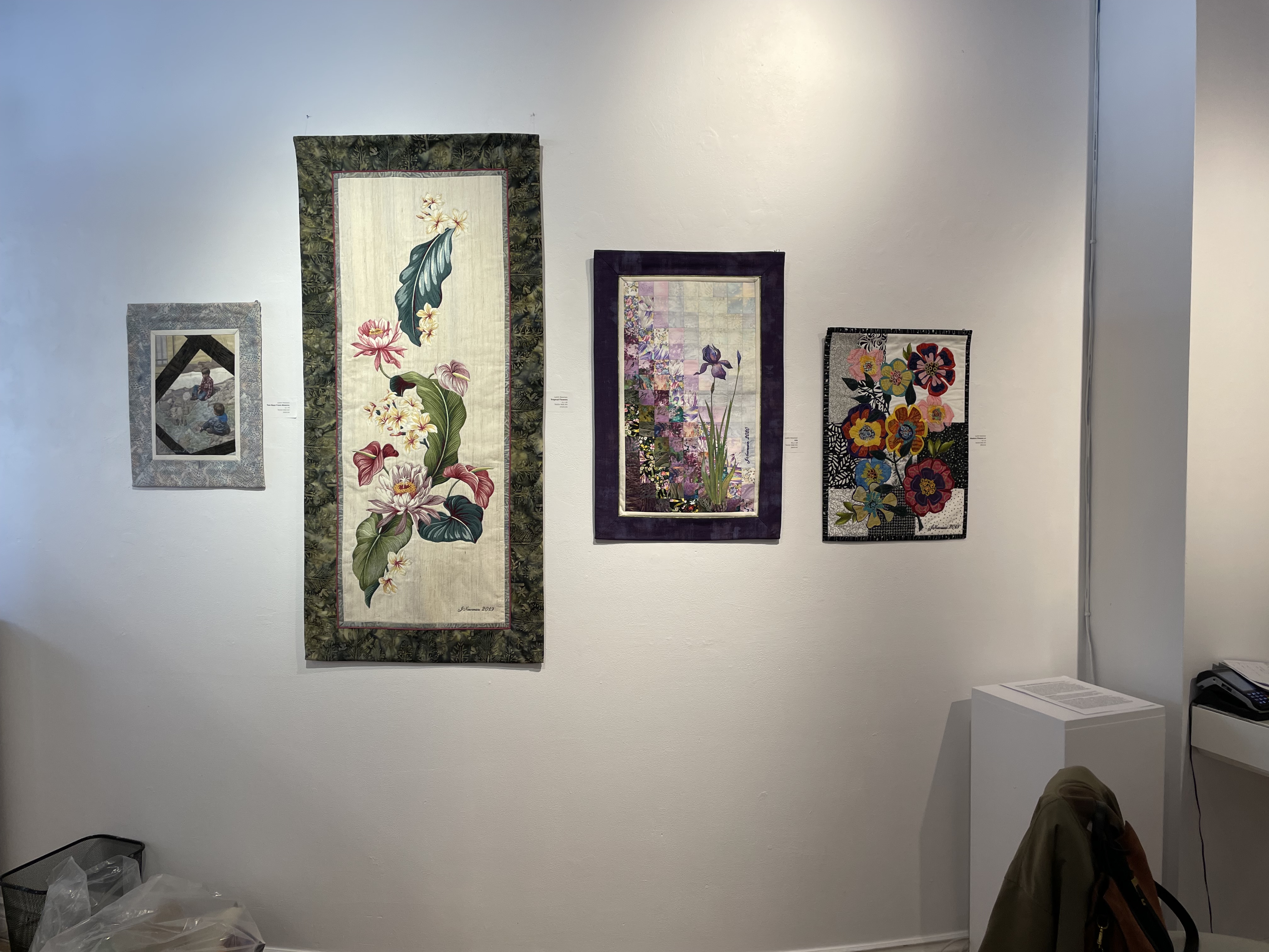
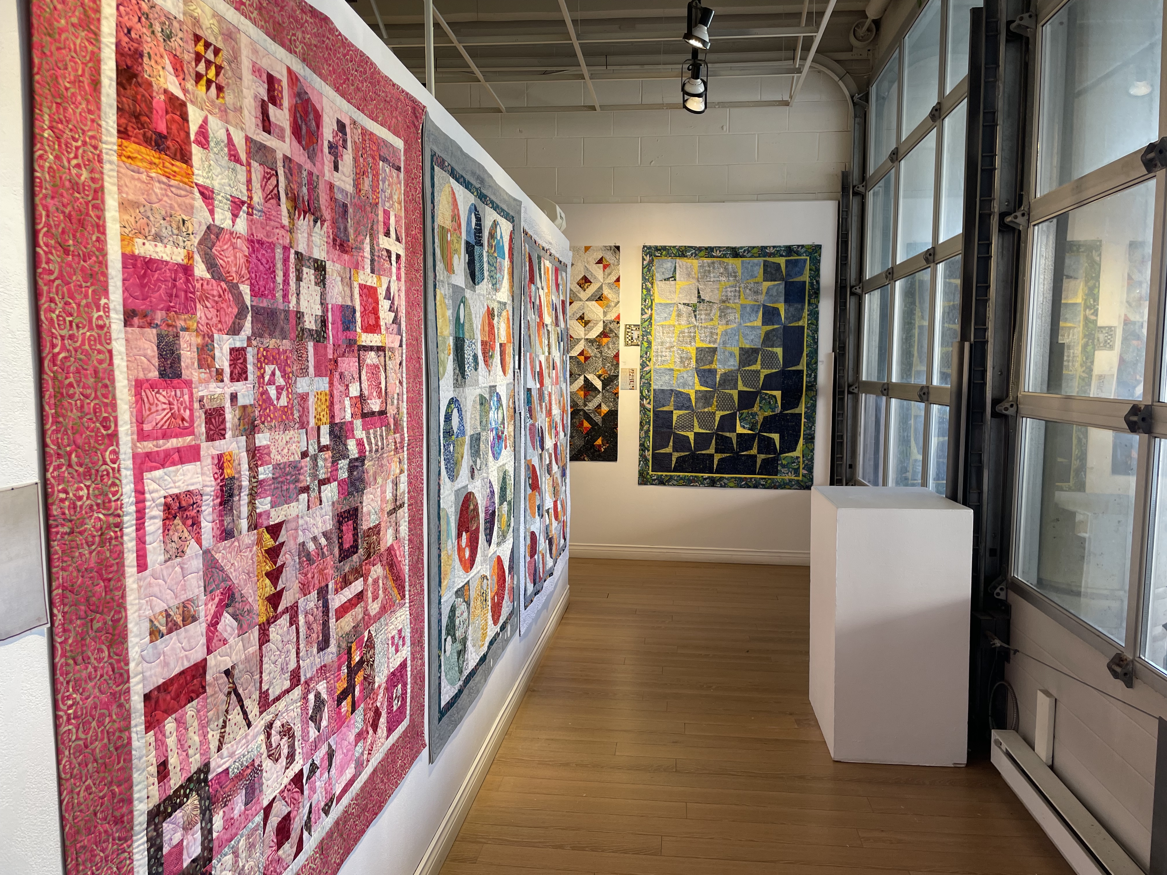
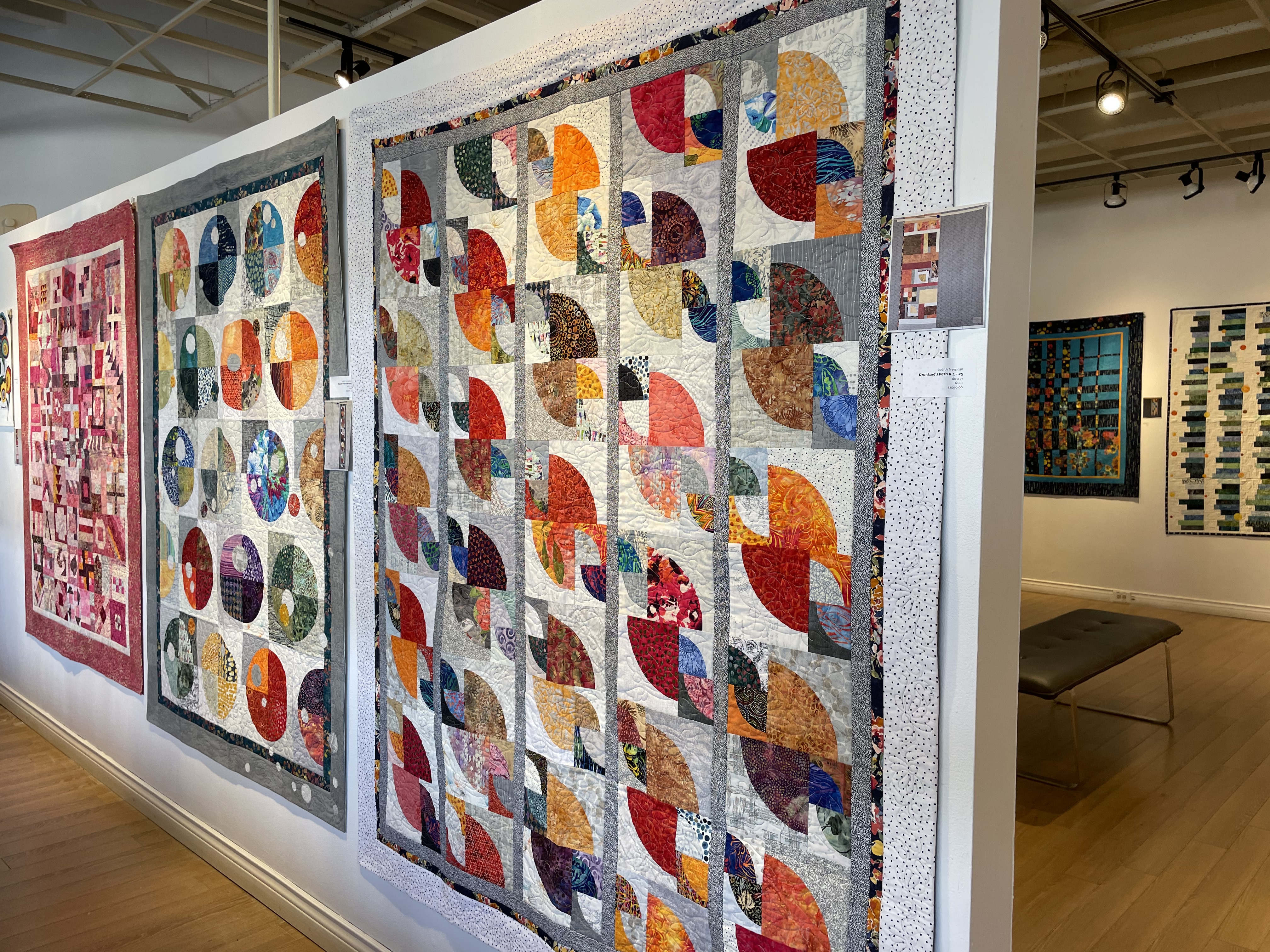
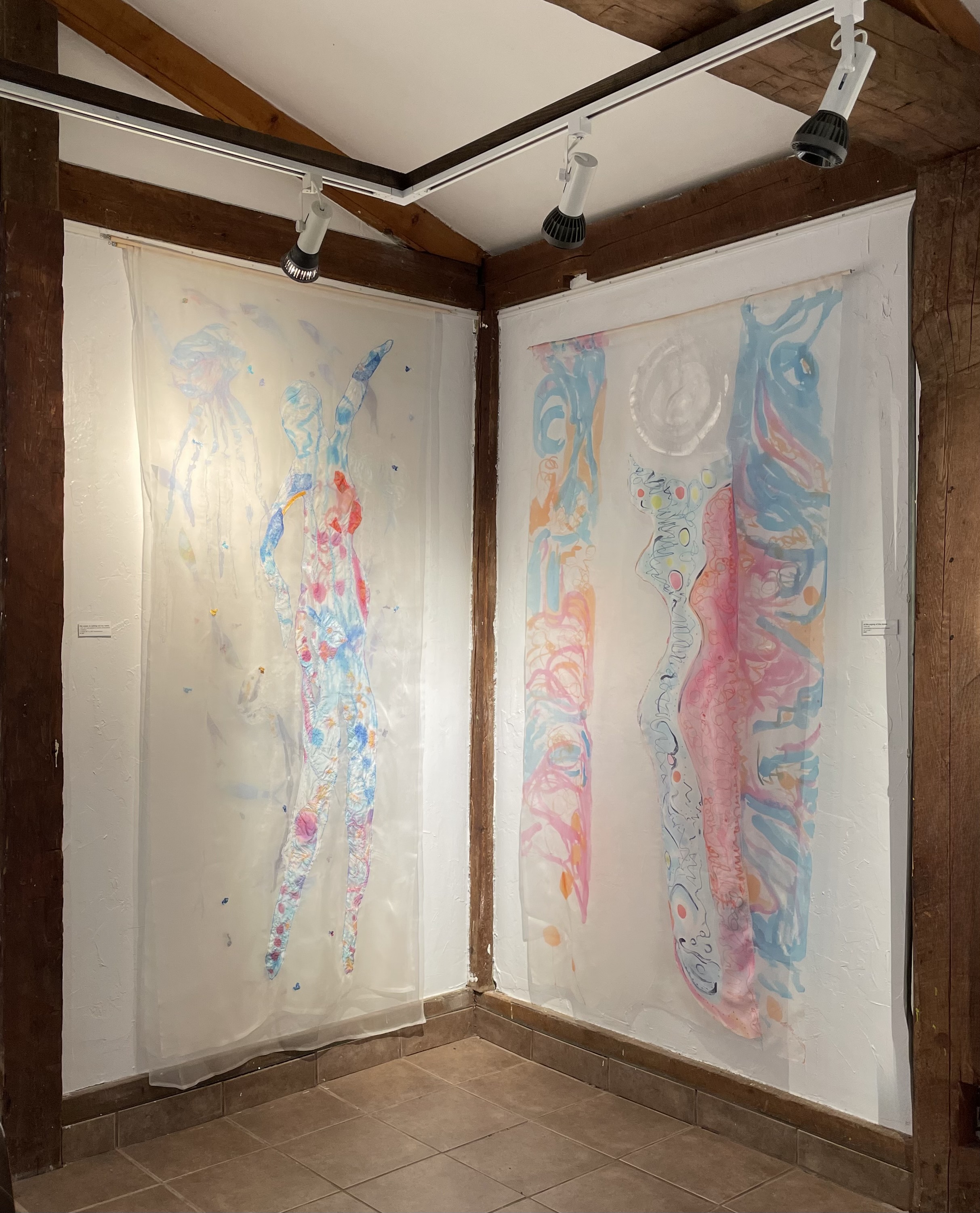
This is how the show looks (click on the images to see enlargements):
The photos don’t do the experience justice – if you’re anywhere nearby, drop in. The quilts and fibre art really need to be seen in person.
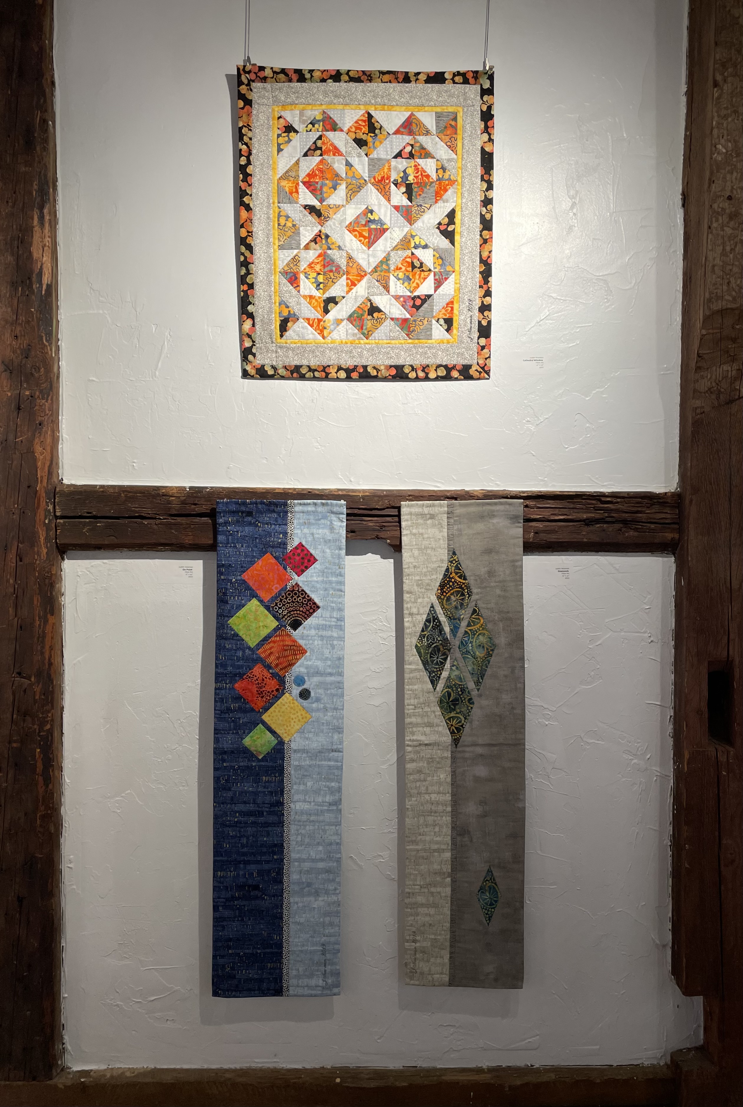
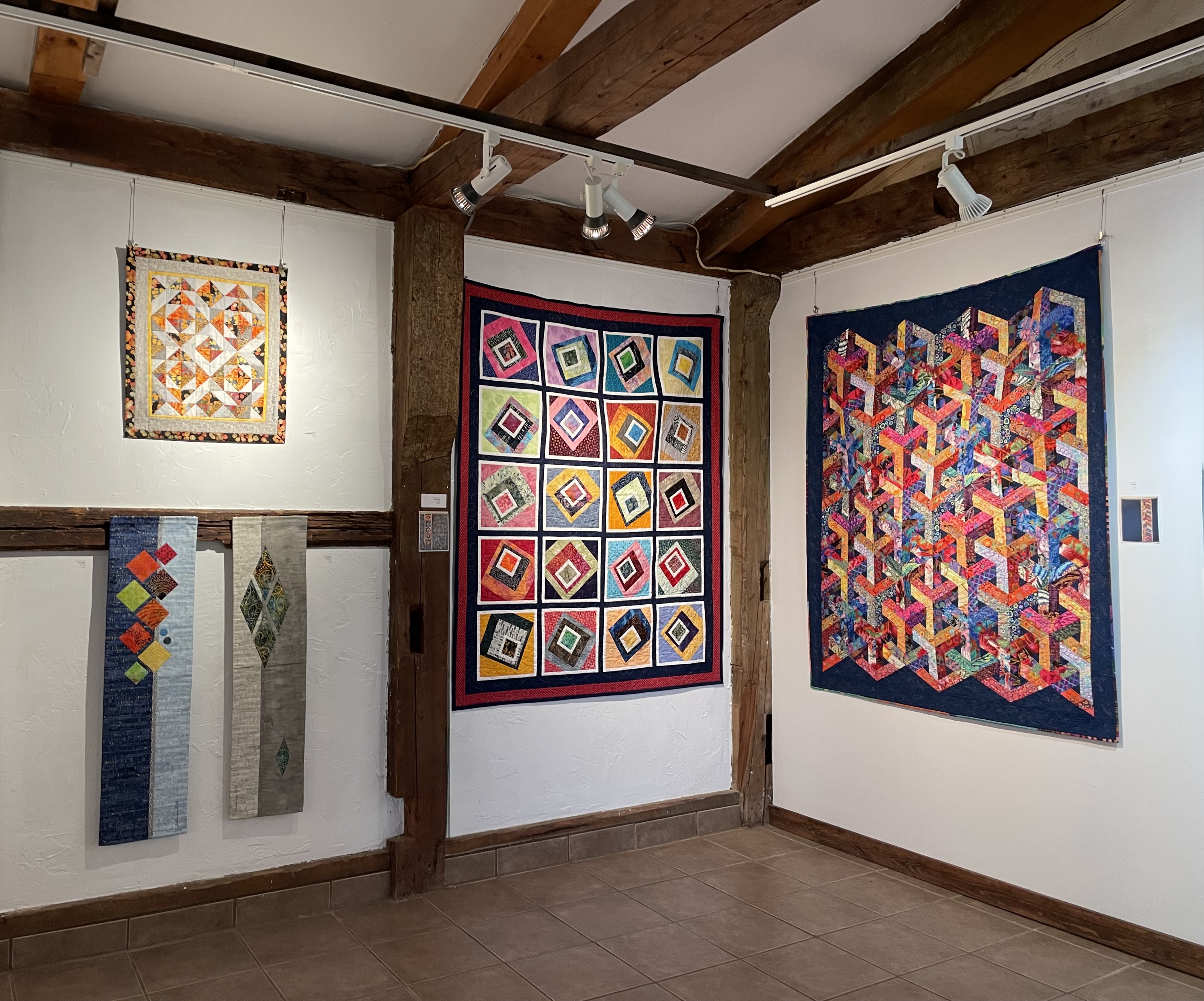
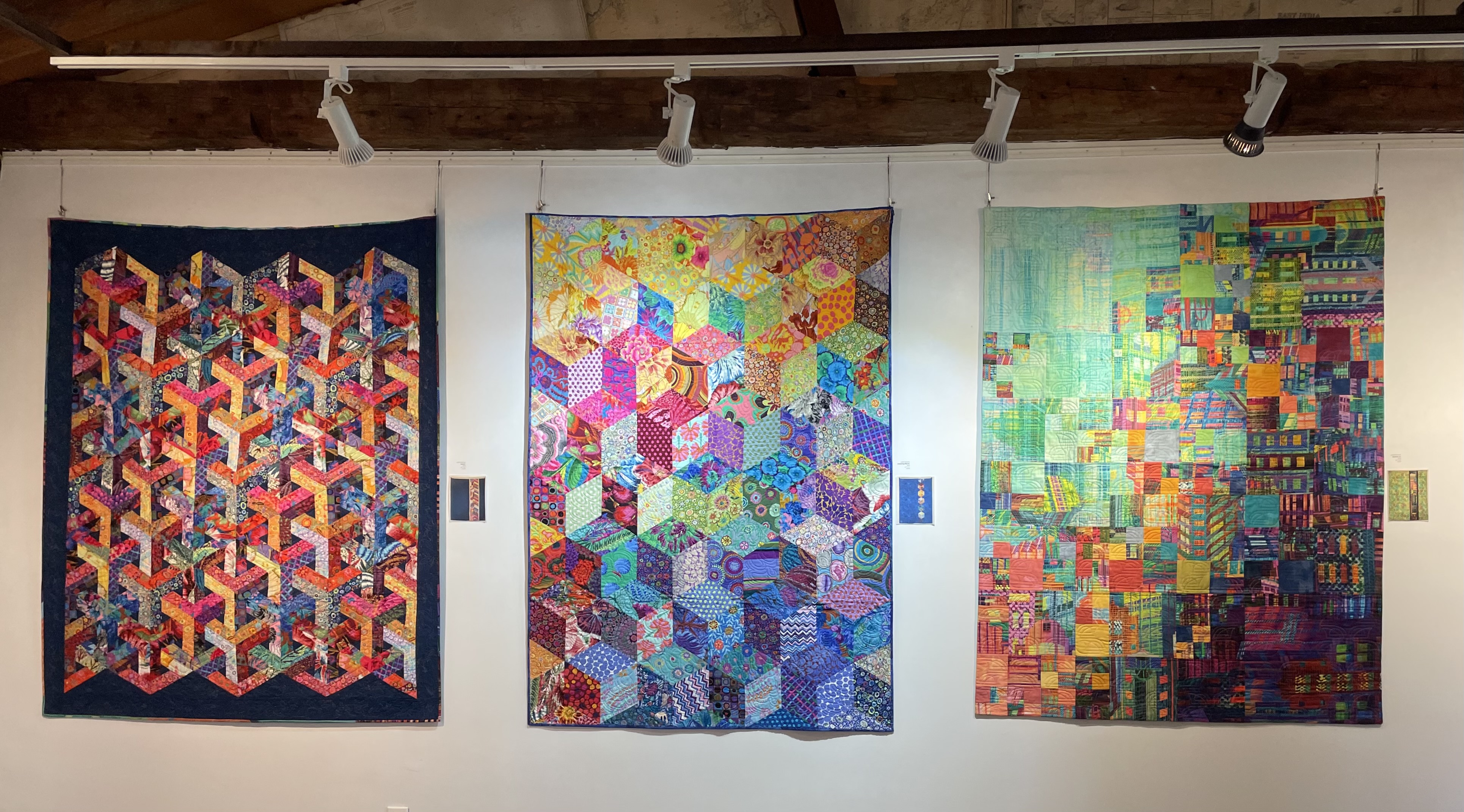
I was in Parrsboro hanging the first show today. It turned out the third woman who was supposed to be in the show with Colleen and me couldn’t make it, so Colleen and I shared the space between us.
Here’s what I hung (plus one more Bargello piece):
Bargello #2Cathedral Windows On Point DiamondsMad TeslaEscherTumbling BlocksSkyline #1 Material Matters! Quilts and Fibre Art
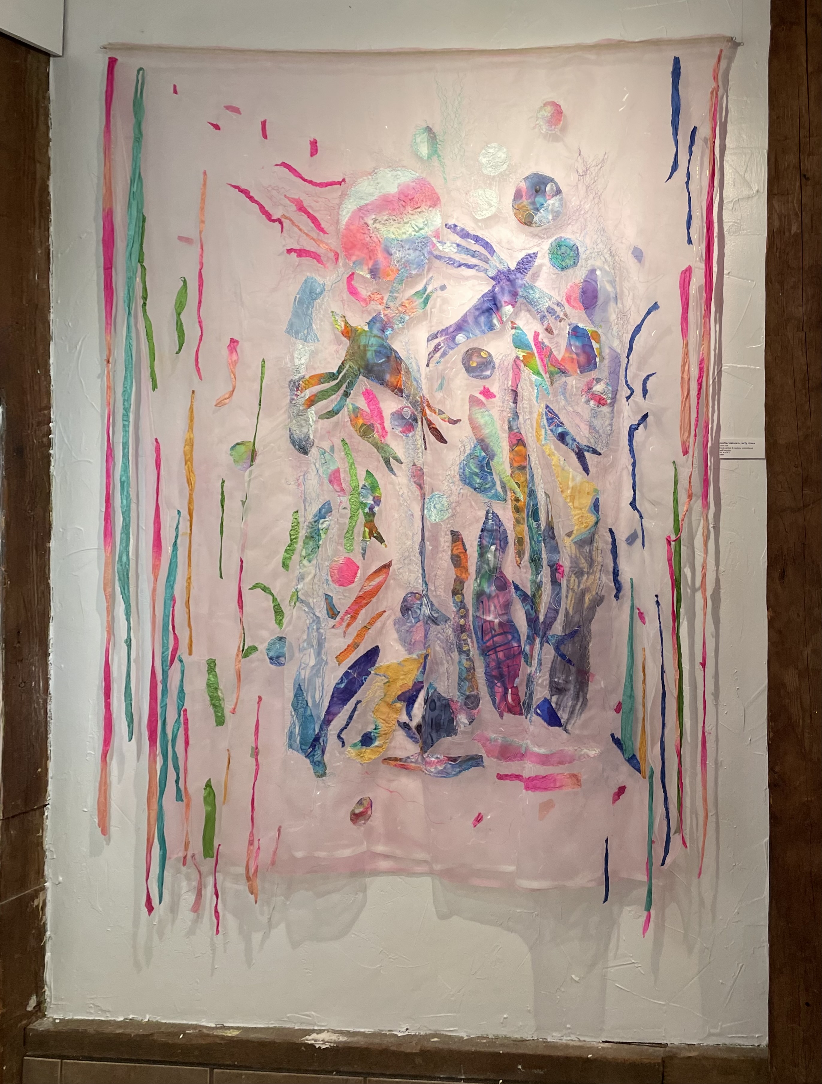
These pieces are by Colleen Davidson – she calls them “Moving Through Water”
Colleen Davidson Moving Through Water
You couldn’t have imagined two such different kinds of fibre work! Yet they hang together very well.
I work with traditional quilting materials using traditional quilting techniques. I play with colour and pattern/texture.
Colleen’s works here are on silk organza which she paints and cuts out and appliqués and stitches. The effects are very interesting and ephemeral! Her pieces all have the translucence and movement of water as the silk ripples with the slight air currents in the room.
I’ve never thought about creating anything like that – but as I work on new things this coming year, I must think about how to move toward more abstract creations!
The show is at Art Lab Studios and Gallery – 121 Main Street, Parrsboro. The show hangs until late Friday afternoon, Nov. 22. Do drop in if you’re in the vicinity!
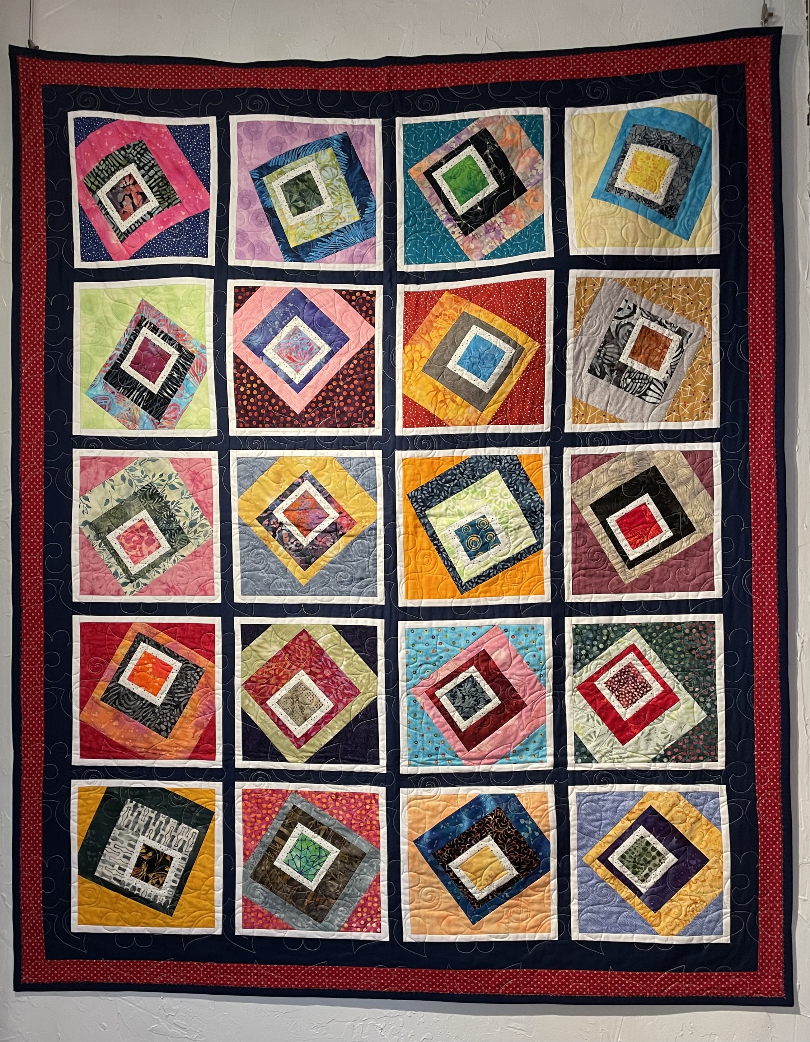
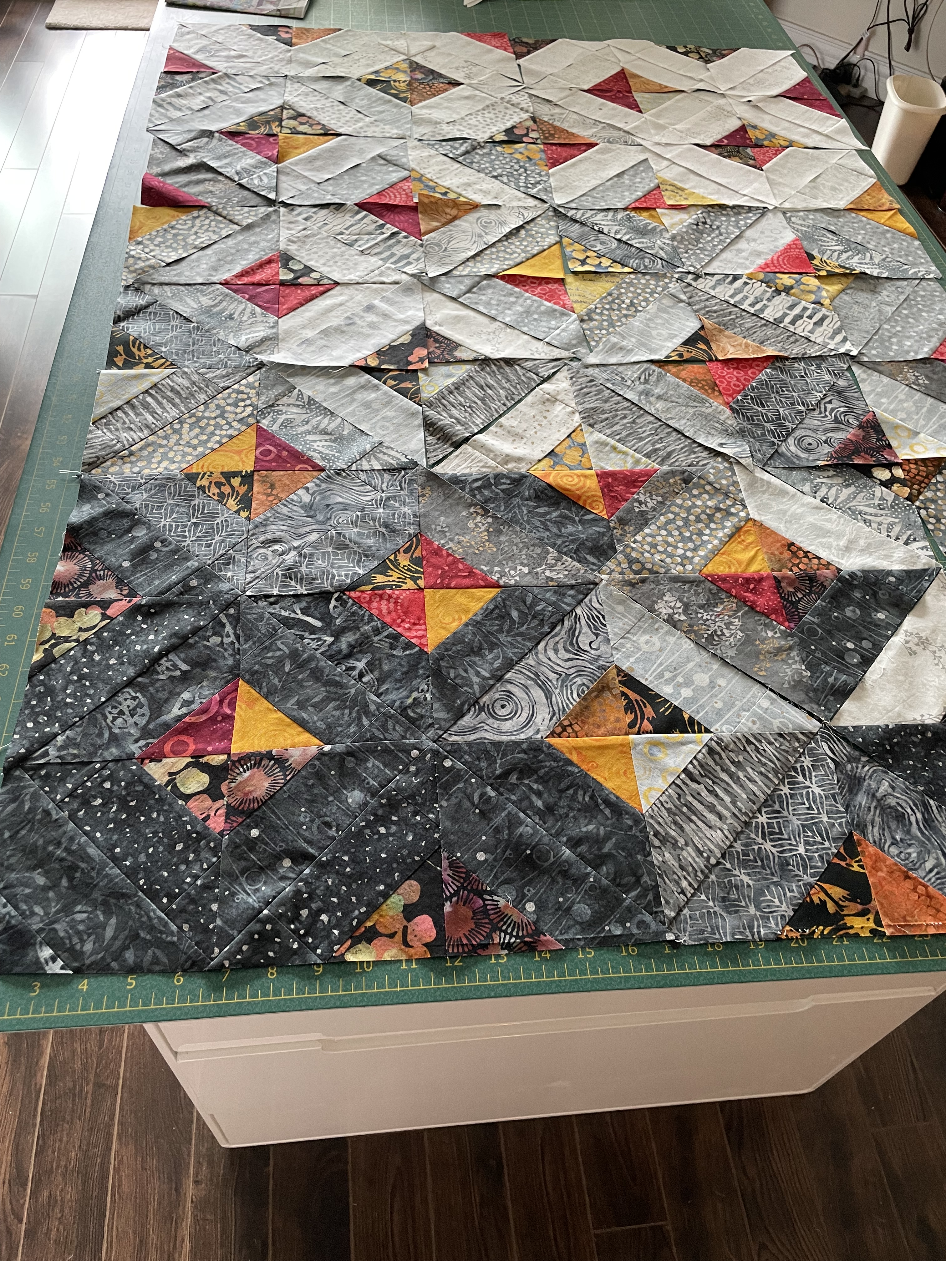
I finally finished this quilt this past week. It turned out to be a lot more work than I anticipated. I thought I was making a simple quilt block – square-in-square but that didn’t work out because of the colour flow I was after. In the end I had to construct each triangle element from scratch! Which took a lot longer.
The back took a lot of “walking around” time – I just couldn’t settle on an idea. One Tuesday evening when my friend Neha was here sewing with me (that’s another story) I made up five square in square blocks from leftover bits – that broke the log-jam and I was able to sort out a 15″ strip to insert in the backing fabric.
Then there was the matter of layout – I sewed most of the dark blocks together to begin with but then had to disassemble the partial panel because the colour flow wasn’t working. To get a decent colour flow, I ended up pinning triangles, and trapezoid pieces on top of the developing panel on a design wall I improvised in order to get a clearer colour placement. Then I had to take blocks apart to insert the new required piece.
I put the layers together. I created two possible block patterns using my out-of-date Pfaff Premier 2+ software (it still runs on my Mac but not for much longer I’m expecting – then I don’t know what I’ll do, because the cost of a subscription for the software on MySewnet is crazy expensive!):
Block 1Block 2
I chose Block 1 after doing a test run with some muslin and batting. I wanted the simplicity of the curves in the first design; I will use the Block 2 design on another quilt sometime.
Because the blocks were placed in the quilt on-point, I had to quilt on the diagonal. When all 44 blocks were filled in, I still had 18 triangle half blocks along the sides with 2 quarter blocks at one end to complete the quilt.
I also changed thread colour to match the colour gradation – I stitched the dark corner with an almost black variegated thread, the top left corner I quilted using white; in between I used three different grey variegated threads to blend with the changing colour. I used a light variegated grey on the back throughout.
I used the off-cuts from the backing for binding – which allowed me to match up the design on the back. I finally added a label.
I finished yesterday by hand basting a hanging sleeve at the top so I can display the quilt. (I still have 8 quilts that need hanging sleeves – gotta get those done over the weekend.)
Been gone a month – I’ve been busy sewing and knitting, and engaged in my daily/weekly routine but for some reason I haven’t managed to sit at the computer and describe what I’ve been up to. So let’s get to it.
Mid August, I wanted to start a new quilt. I looked through my fabric stash and decided to use a jelly roll I’ve had for a couple of years.
Jellyroll Strips Laid OutContrast FabricsContrast Fabric With JellyrollSquares In Squares
The jellyroll fabrics (20 strips) ranged from black to white with many gradations of grey. Dull on its own – I decided I needed some strong contrasts. Because the strips were batik, I selected bright batik scraps to contrast with the black/white. I decided to make “square in square” blocks, cut them into triangles on the diagonal, then arranged them in squares again. All is fine, until I try arranging the resulting squares into a larger array only to end up with a hodgepodge I wasn’t happy with.
First Attempt
There’s a hint of a gradation from black to white but it doesn’t work overall because each of my blocks has light/medium/dark elements and to get a good colour flow I need some blocks that are very dark and some that are completely white. To make that happen I had to make many more blocks from scratch.
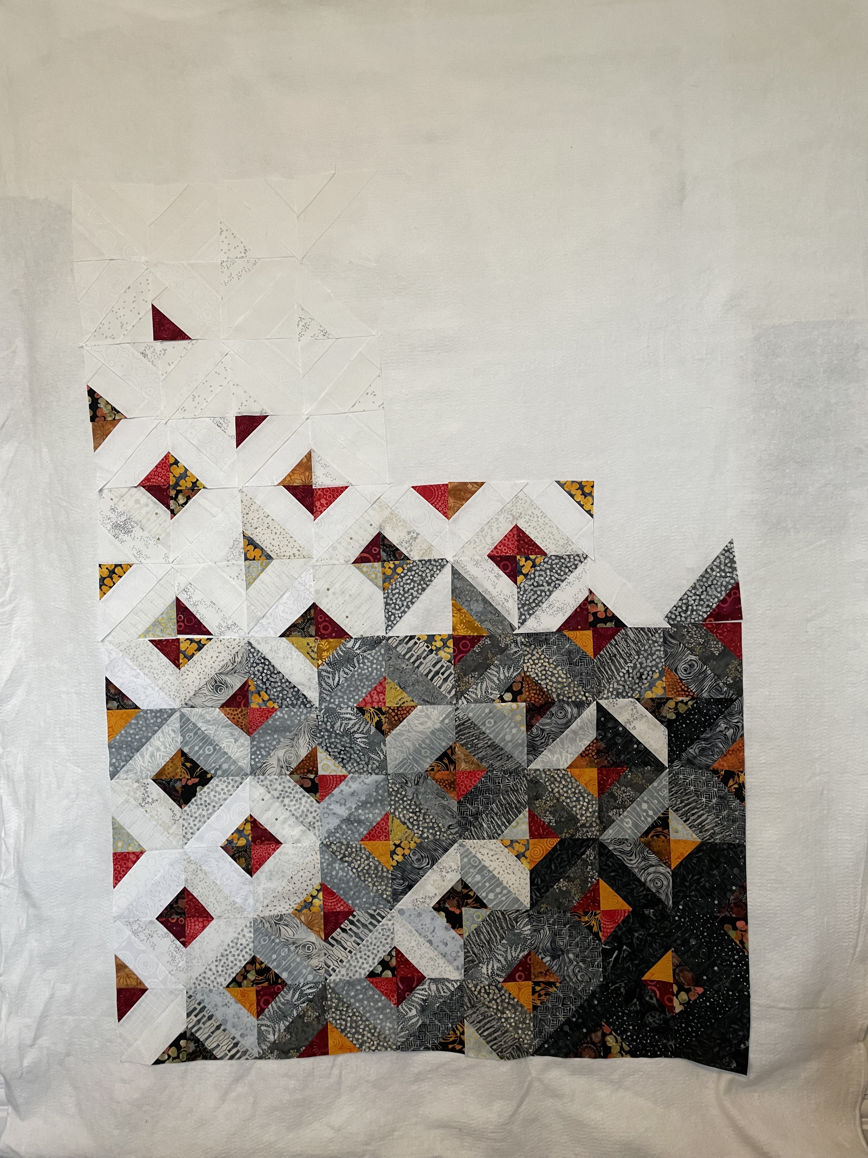
Second Array
This time, I established a dark corner and a light corner and tried filling in. I was working on my cutting table, rather than on my floor beside the cutting table as I usually do, because I’d injured my right knee and couldn’t get up and down. It didn’t occur to me at that moment that I could set up a design wall using a length of batting hung from a rod in my spare room (in front of the closet door) to hold the triangles/squares to audition placement – that came later.
So I filled up my cutting table with a layout I thought would be the darker bottom half of the quilt top. I made the mistake of actually sewing these blocks together into a 6×12 array. I was planning on filling the cutting table again this time with the top half but then I couldn’t see what I’d already constructed. This was when I set up a design wall:
Array #3
I placed the assembled bottom half of the panel at the bottom of the wall and started laying out more blocks. Two things were immediately obvious: 1. I didn’t have enough “black” extending from the lower right corner and 2. the grey extended too far across in the middle of the emerging piece. I’d also run out of triangles at this point and needed to make another 60 or so.
By this time I had stopped making squares in squares and instead I cut trapezoids from the jellyroll strips (I had to open the second package I had on hand) as well as triangles from the contrast fabrics. I’d figured out that working with reassembled squares wasn’t helpful – I was better off constructing just triangles where I could control the colours I was juxtaposing and had more freedom when placing them.
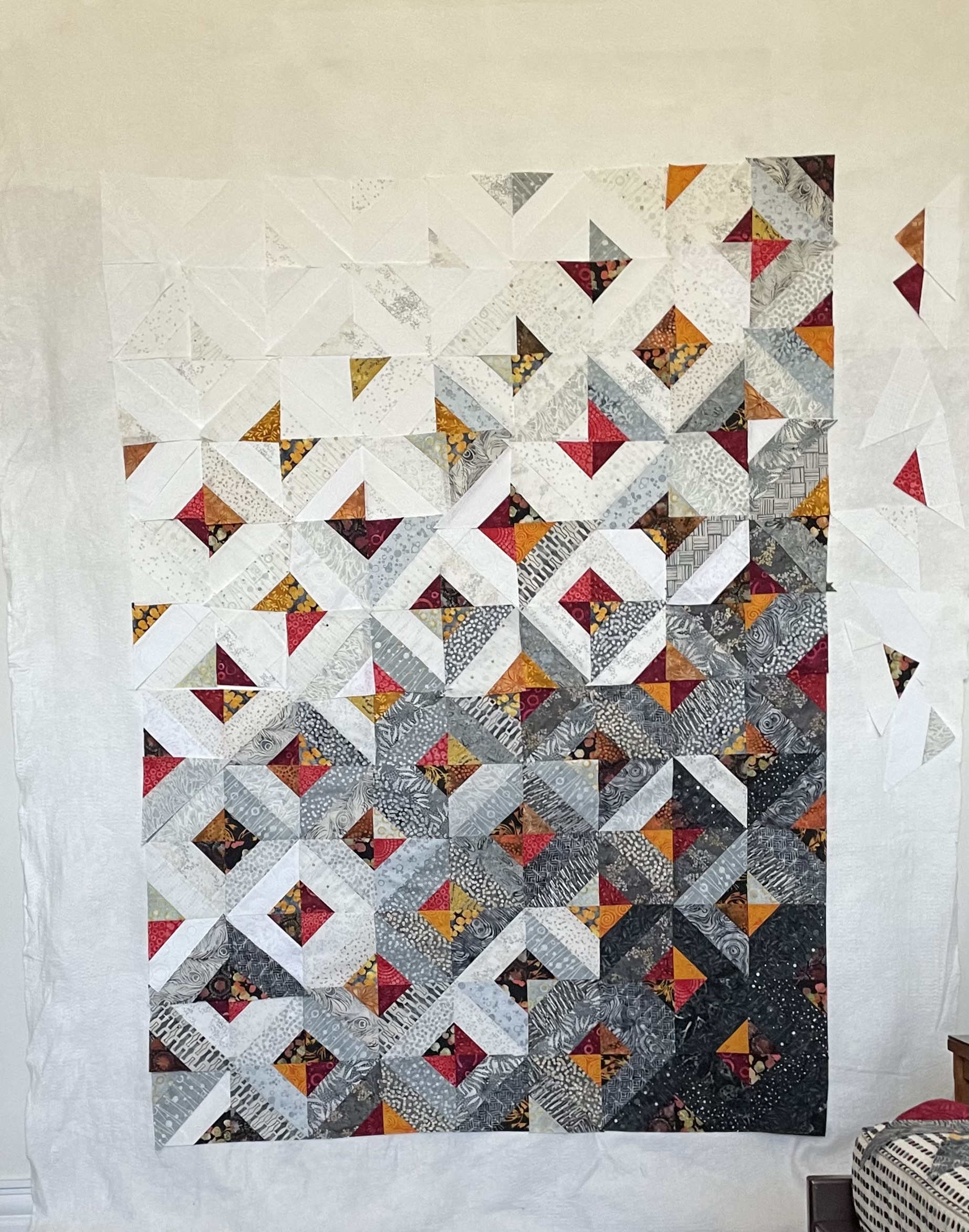
Array #4
Close, I thought but I still wasn’t completely happy with the colour flow so I played with it over the next few days – shifting blocks in the top half, and pinning other triangles over existing triangles in the sewn bottom portion.
Final Array
It took a couple of days looking at the design wall and moving and pinning elements until I was finally satisfied with the look of my panel. Yesterday, I took a photo, then very carefully stacked the pieces in the top six rows, numbering each stack so I knew the order and orientation of the pieces in each stack. Then I carefully repinned and labelled the changes I’d made to the bottom panel – knowing I would have to take much of it apart in order to get the arrangement I wanted.
It’s taken the better part of two days to reconstruct the bottom half of the quilt top:
Reassembling In ProgressFinished Bottom Portion
Now I have the bottom portion of the array back together – many of the changes were subtle ones, mainly involving extending the darker batiks further across the panel, limiting the lighter, brighter trapezoids and triangles until the mid area.
Tomorrow I’ll start sewing the six top stacks together, row by row – it won’t take long because I’m not having to carefully unstitch many interlocked seams!
As you can gather, this whole process would have been much easier had I planned out on graph paper what I was thinking about, but that’s not how I seem to work. I much prefer just starting and building and designing as the project unfolds. I find improvising so much more interesting because I have no idea where I’m going to end up. Always a surprise and satisfying. It’s how I write as well – just get some words on the screen and see where they take me. I never know what I’m writing about until I get well into something and an ending emerges. That’s my creative process.
I have no idea what I’m going to do with the back – do I want to make another 36 of these triangle elements for an insert or do I want to try something else – still thinking about that.
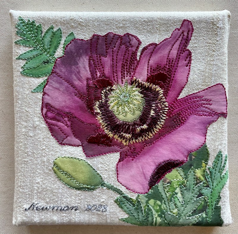
I have just completed this series of twelve 6×6 wall art pieces. You may remember the previous efforts in 2022 and 2023. Early in the spring Brandt Eisner sent out an invitation to participate in another “pop-up” 6×6 show. I agreed to participate and decided to play with “flowers” one more time.
An Original 6×6 Wall Art PieceSecond Iteration of 6×6
This time I decided to make the panel more abstract – one or two fabric circles appliqué with an embroidered abstract flower stitched on top, filled in with some leaves that I’d thread paint. I did several mock-ups.
I’d managed to get the construction of four pieces done (with four more partially assembled) when Brandt sent a note that the show was being cancelled. That stopped me dead. It was the middle of June – I was working toward an early July deadline – and I stopped. Just couldn’t get going again.
Two weeks ago, I finally picked up the silk background squares I’d prepared, pulled out the box of circles, and began assembling some 6×6 arrangements. Once underway, I was able to keep working on the project and this afternoon I finished the pieces, completely mounted on blank canvas frames, with paper backing and saw-tooth hangers.
This project is ready for the November Craig Gallery solo show!
I had time early afternoon to construct five more blocks and set up three more with red centres which will be predominantly white. So try imagining the empty spaces with blocks constructed using just the light fabrics (with maybe a hint of grey, or perhaps a touch of red/orange in one of the layers.
I’ve decided laying the blocks on point lets the colour flow better than having them sewn in straight horizontal/vertical rows/columns. (Although I may try that layout once I have all the blocks constructed.)
I hope to get the remaining coloured blocks sewn tomorrow. Then on to making a bunch of white one.
I haven’t been travelling, just getting on with life with small projects I haven’t bothered to report on.
Boomerang Quilt Completed
I finished the Boomerang Quilt ten days ago (seems longer than that somehow). I took it to Sew With Vision to show the gals how I used the fabrics I bought there. Sally wanted me to display it to advertise a class we’re scheduling – you never know whether there will be any interest or not.
I’ve been working on darning some socks – one pair for me, two pairs for friends. I’ve another sweater needing restoration sitting with my knitting waiting for me to make time to work it.
A while back I came across another minimalist quilt which I’ve begun working on. It’s based on the Log Cabin block which I haven’t made in a gazillion years. Made from scraps, I thought it worth trying. I have no idea what size the quilt in the image turned out to be; I want a lap quilt – so something that’s approximately 50″x 65″.
Improvised Block – 9 1/2″
My first try gave me an idea for proportions – some wider strips, some thin, ending with a wider outer strip which includes the seam allowance. I want a trimmed block that is 9″ square finishing at 8 1/2″ square. My test block works, but it’s too large at 9 1/2″; I started with a square that is a bit too large and it’s bound by strips that are a bit too wide. By shrinking the square by 1/2″, and the first strips by 1/4″ I should end up with a wider outer strip and be able to trim to 9″.
Now for a second block with some revised measurements to see what I end up with. I have a bunch of “Grunge” fabrics shading from off-white to cream. The “background” of the quilt will be a blend of the light with orange/gold/deep red and various grey/dark grey elements inserted in the strips.
Fabric with Fat Quarter Solids – ColourIn Black/White to Show Values
I was looking at the print fabric and the solid fat quarters and thinking I didn’t have “light” in my collection. So I eliminated the colour to see what my tonal contrasts looked like – not too bad, but I could use a bit more light in my colour assortment.
Also, I want to showcase the print even though, in a sense, it’s the background. I found an idea on Pinterest I thought might accomplish that for me:
You have to stretch your imagination to visualize the white above as my print fabric, and the print triangles as my solids. Even further, I’m thinking I will break up the triangle with strips from at least two different solids and include a narrow strip of the background fabric as well.
Just playing around with scrap fabric I start to get a sense of what this idea might yield:
Playing Around
Now imagine that bullrush print as my bright yellow/orange/turquoise/green fabric, those triangle elements as the bright solids above and you get a glimmer of where I think I’m heading. I have more bullrush fabric and a couple of different brown/taupe solids to add to the above – tomorrow I’ll do those and include them to the array.
There is actually a pattern for this quilt online: Lagoon Quilt Tutorial but I’m not planning on following it. The block size in the pattern is 4 1/2″ – I want to end up with 5″ or 6″ blocks (not sure which yet). My final quilt size will be more rectangular then the Baby or Lap quilts for which Erika @ KitchenTableQuilting gives dimensions. Her triangles are “solid”, mine will be striped. Lots of differences. What I’m taking from the quilt photo is the inclusion of squares from the background fabric – in my case, the foreground fabric! What I didn’t want was to bury that very interesting print amidst the solids – this way I can showcase it.
One thing stopping me from proceeding at the moment is that I don’t have enough of the print fabric. I’ve ordered some (because my local shop has none left), and I’m waiting for it to arrive! (I’m also in hold mode because my right wrist has decided to be painful – arthritis that will take a bit of time to settle down – cutting with a rotary cutter is almost impossible and I tried but can’t cut with my left hand). As soon as the fabric arrives (and my wrist settles down), I’ll get to work on this quilt.
I chose to complete this quilt with a facing/hidden binding (mitred corners) and did the hand stitched blind hem on the quilt back this morning.
The quilting took just three days – that’s because I elected to quilt the top in 4-block squares. That meant each row had to have a half design (because the top was constructed with 9 columns). I decided to stagger the quilting blocks so the half block elements alternated from one side to the other – half using the right side of the design, the other half using the left. Nobody but me will ever notice. All anyone looking at the quilt will see is the fact that it is quilted! I chose thread to match the background fabric on top; the bottom thread matches the blue/grey background fabric – same weight Wonderfil variegated, just a different colour. I embroidered the standard label I always use in a dark navy blue – I usually mute it to blend in but decided this time to make it stand out!
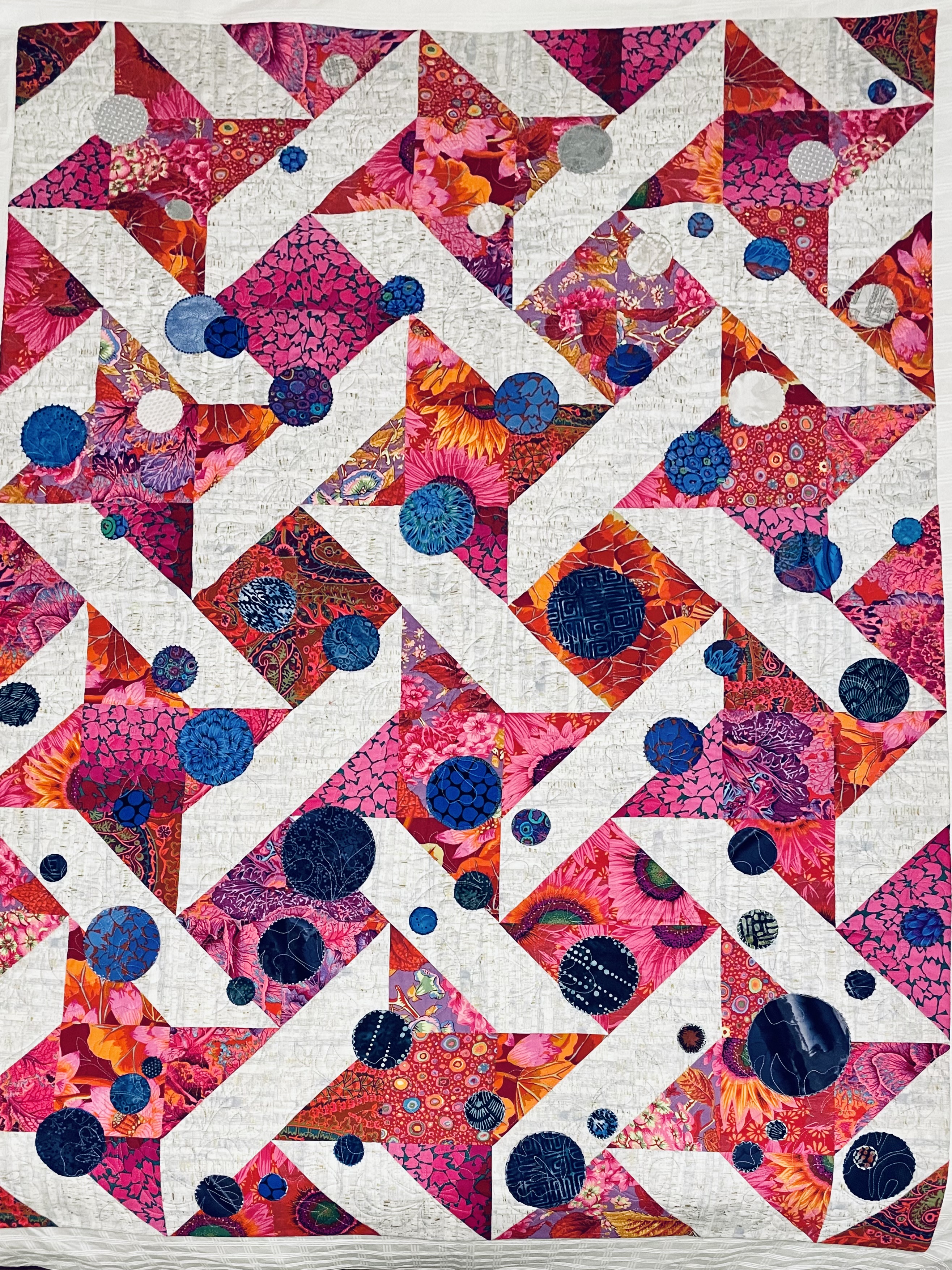
[BTW, no dragonflies, no embroidery – in the end I decided to let the circles be the focus of the work. In the photo you can see the colour and density change from bottom to top of the quilt – which was intentional.] I pieced the quilt back from scraps left over from the quilt top.
I was showing this quilt (top finished but not quilted) one evening last week to two friends when I realized if I build my next quilt using some version of half-square triangles, that would allow me to pull four-five quilts from my collection to go with it – my Parrsboro showing coming summer could become a collection of quilts created from half-square triangles! Each quilt would be seen differently because the HST theme would provide a new context. So now to think about block sizes and ways of combining the main fabric with the solids so the solids don’t take over the quilt – I want to showcase the print!
The print is Eclectic Elements – Abandoned (Rusted Patina) by Tim Holtz for Free Spirit. What grabbed me about the fabric was the rich colour pallet in yellow/oranges and turquoise/greens. When I pulled the solid fat quarters from a nearby box (conveniently at hand on the table in the shop) and laid them on the print the whole came alive. I figure there has to be a way to use the solids so they create a background and the print becomes the dominant feature (rather than the other way around – which is what I fear may happen)! My idea is this: start by cutting 4 1/2″ strips from the print, then cut 2 1/2″ strips from the matching solids, sew them together in pairs, then create a tube from the print strip and the two solids strips, from which I can then cut half-square triangles! I may want to subdivide the solids even further before I pair them with the print – to break up the concentration of solid colour….
I need to play with this idea using scraps to see what actually happens!
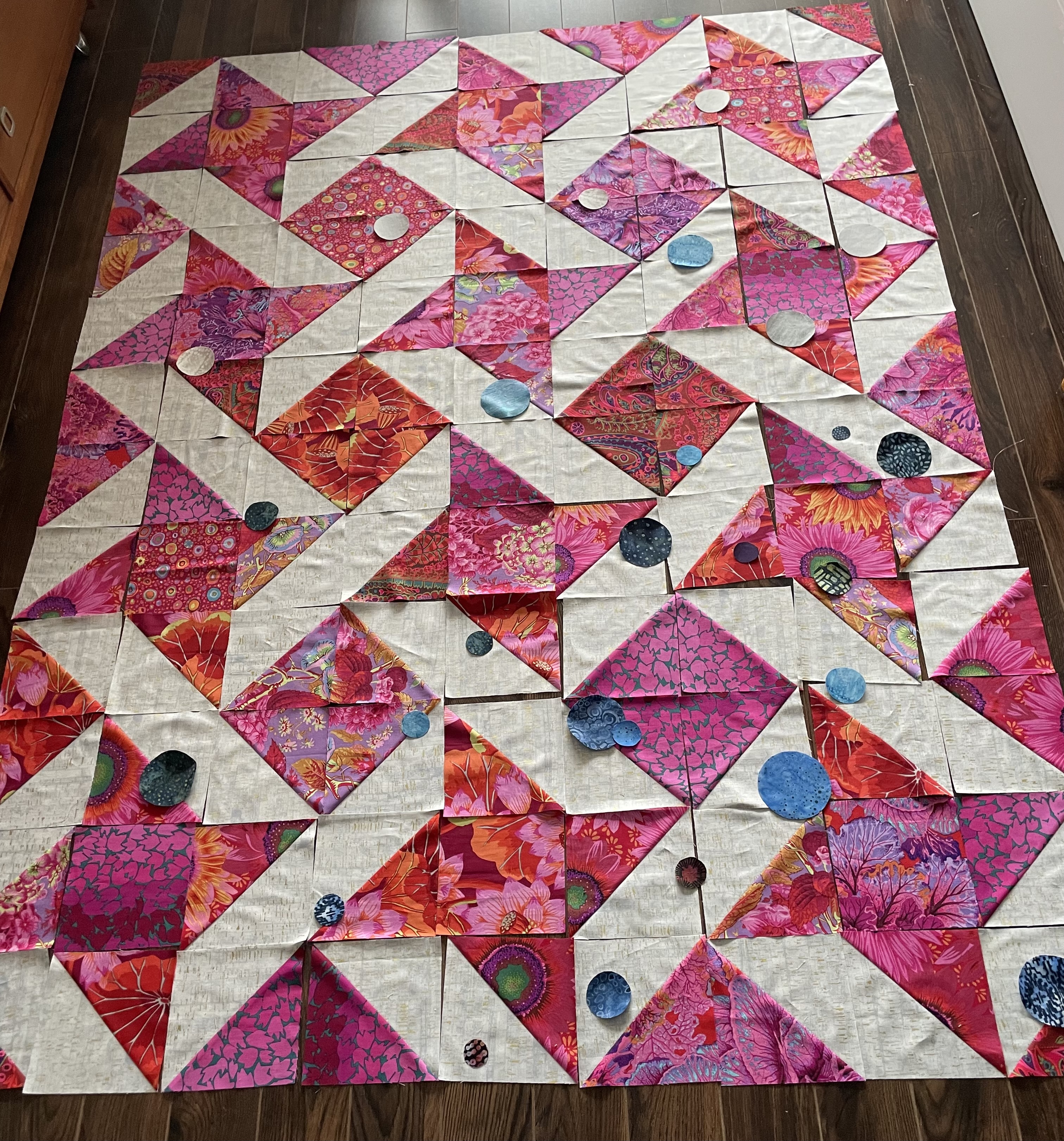
I dug out my stash of circles with fusible web and selected the blue and grey in whatever size I had and dropped them over the blocks. This tells me several things
I want a few circles larger than the largest I have here
I want to graduate my distribution from bottom right (darkest) to upper left (less dense and lightest)
I want greater density and more sizes of circles in the lower right
I will edge stitch the circles – what I don’t know yet is whether I also want to include some embroidery along with the appliqué – I think it may be a good idea – not much, but circles of some sort embroidered with blue threads
I’m trying to focus on something happening in the foreground rather than on the background quilt design