I chose to complete this quilt with a facing/hidden binding (mitred corners) and did the hand stitched blind hem on the quilt back this morning.
The quilting took just three days – that’s because I elected to quilt the top in 4-block squares. That meant each row had to have a half design (because the top was constructed with 9 columns). I decided to stagger the quilting blocks so the half block elements alternated from one side to the other – half using the right side of the design, the other half using the left. Nobody but me will ever notice. All anyone looking at the quilt will see is the fact that it is quilted! I chose thread to match the background fabric on top; the bottom thread matches the blue/grey background fabric – same weight Wonderfil variegated, just a different colour. I embroidered the standard label I always use in a dark navy blue – I usually mute it to blend in but decided this time to make it stand out!
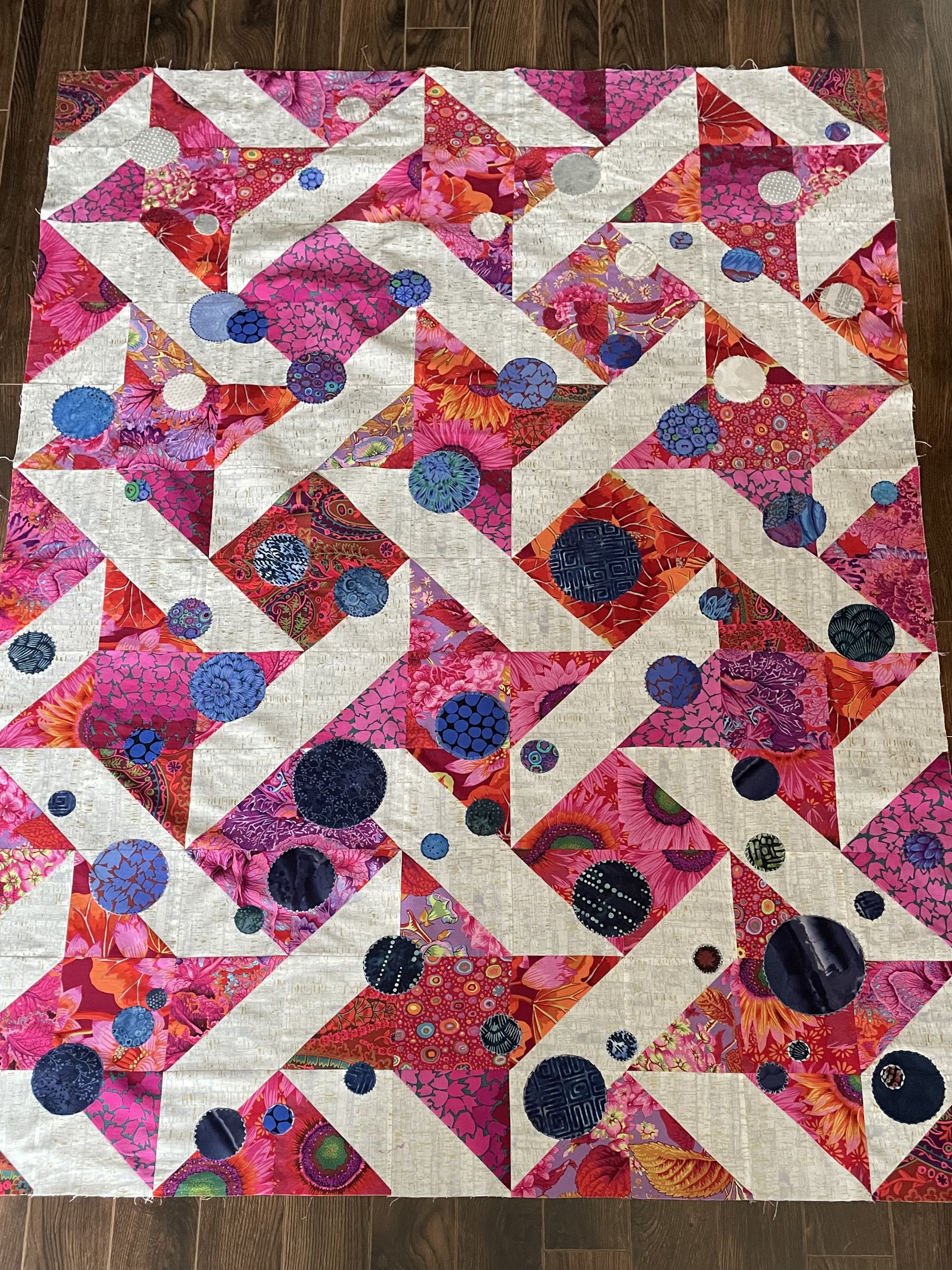
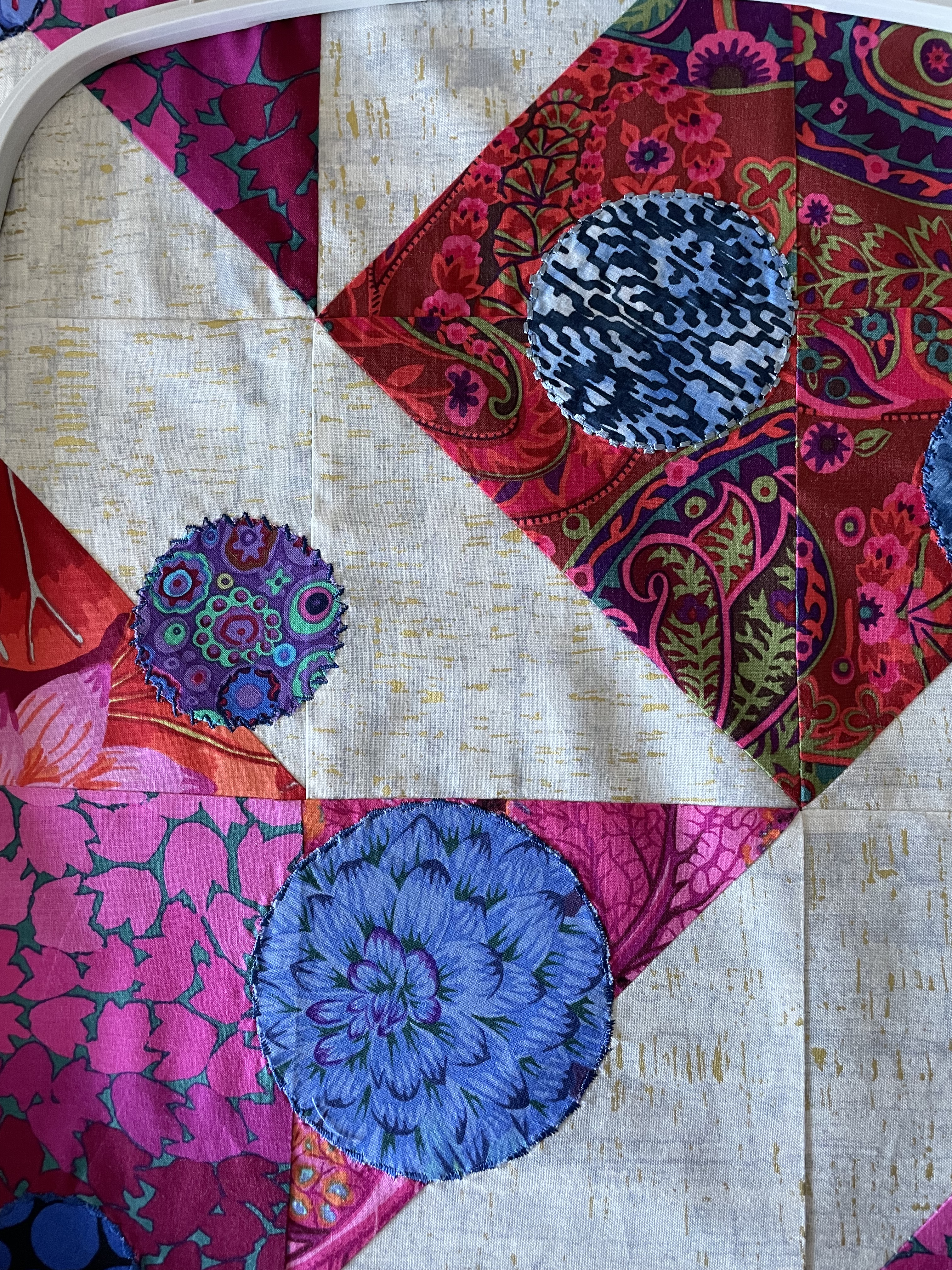
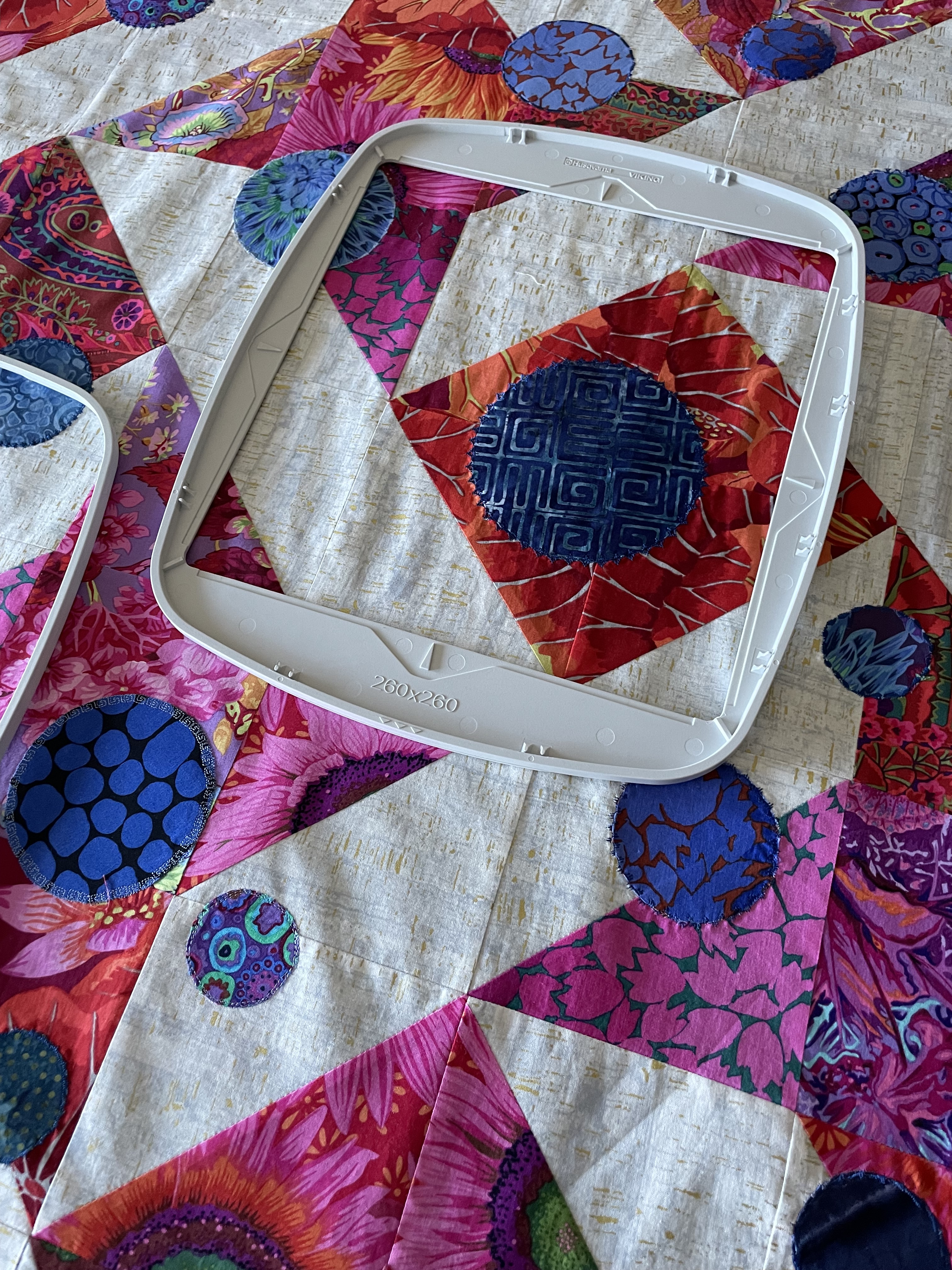
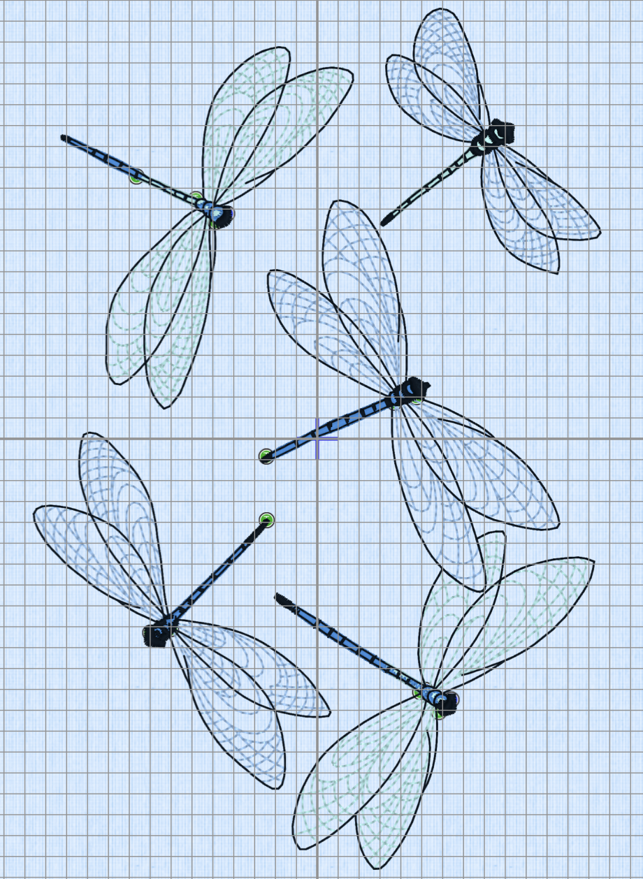
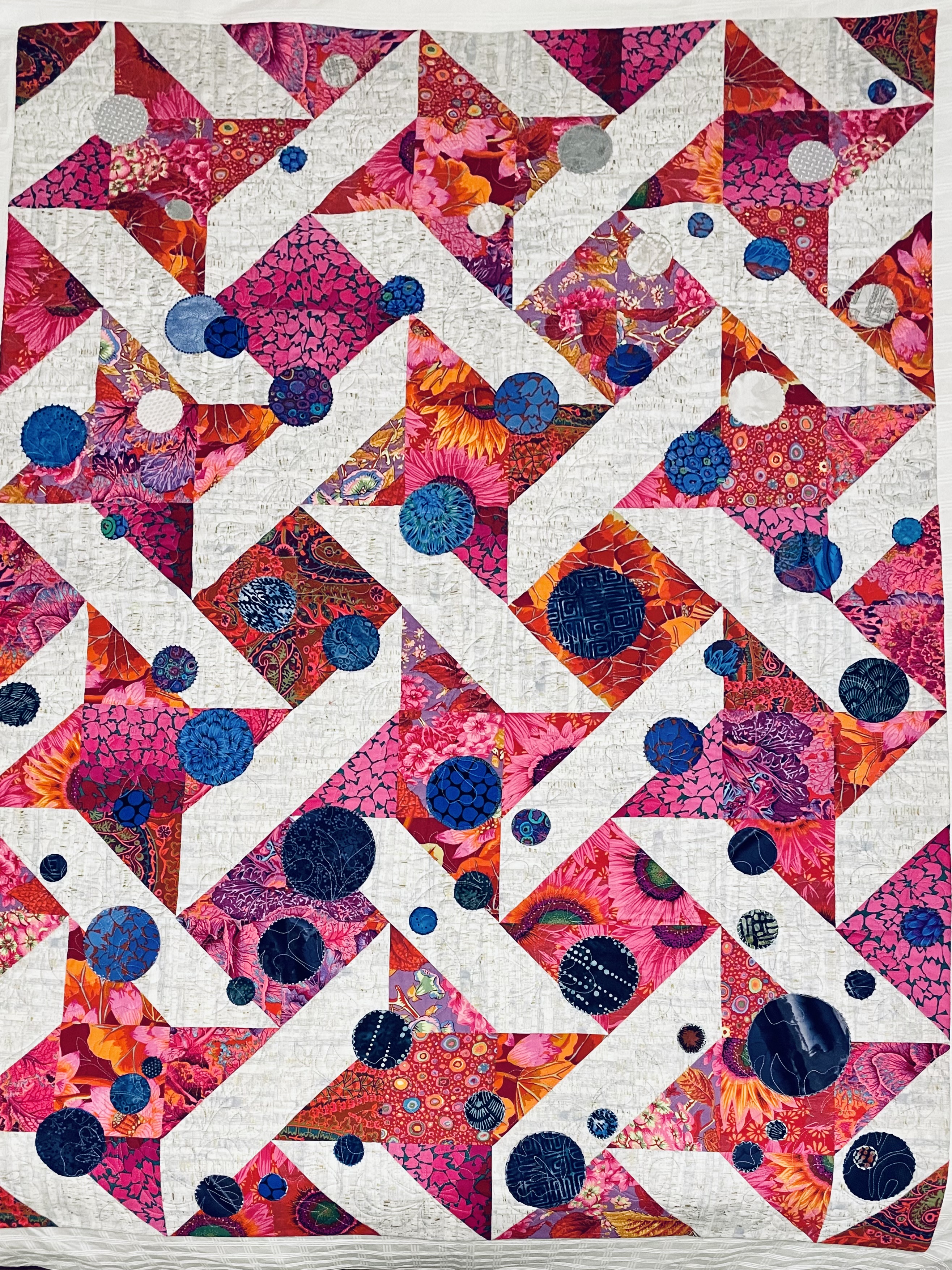
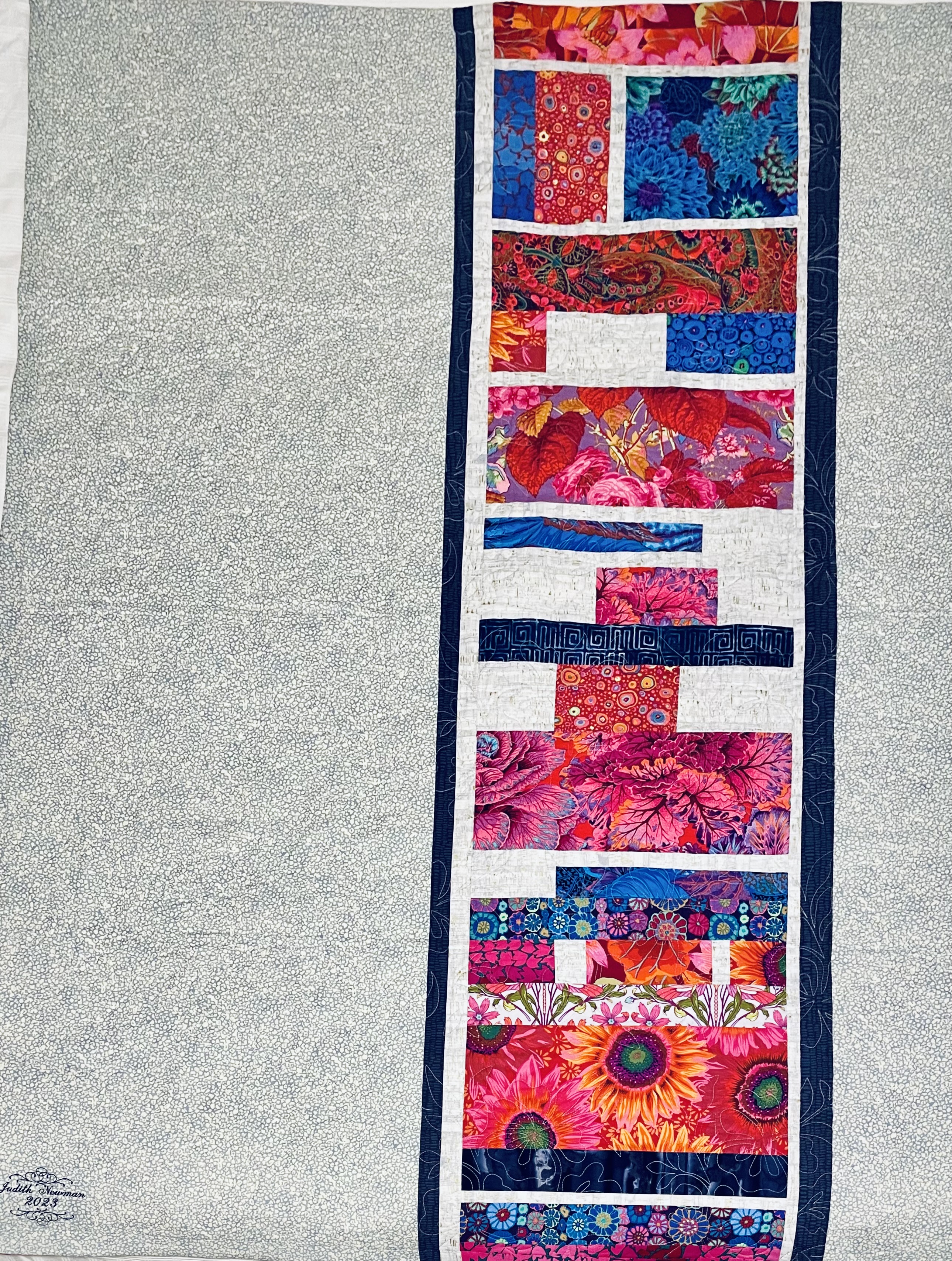
[BTW, no dragonflies, no embroidery – in the end I decided to let the circles be the focus of the work. In the photo you can see the colour and density change from bottom to top of the quilt – which was intentional.] I pieced the quilt back from scraps left over from the quilt top.
I was showing this quilt (top finished but not quilted) one evening last week to two friends when I realized if I build my next quilt using some version of half-square triangles, that would allow me to pull four-five quilts from my collection to go with it – my Parrsboro showing coming summer could become a collection of quilts created from half-square triangles! Each quilt would be seen differently because the HST theme would provide a new context. So now to think about block sizes and ways of combining the main fabric with the solids so the solids don’t take over the quilt – I want to showcase the print!

The print is Eclectic Elements – Abandoned (Rusted Patina) by Tim Holtz for Free Spirit. What grabbed me about the fabric was the rich colour pallet in yellow/oranges and turquoise/greens. When I pulled the solid fat quarters from a nearby box (conveniently at hand on the table in the shop) and laid them on the print the whole came alive. I figure there has to be a way to use the solids so they create a background and the print becomes the dominant feature (rather than the other way around – which is what I fear may happen)! My idea is this: start by cutting 4 1/2″ strips from the print, then cut 2 1/2″ strips from the matching solids, sew them together in pairs, then create a tube from the print strip and the two solids strips, from which I can then cut half-square triangles! I may want to subdivide the solids even further before I pair them with the print – to break up the concentration of solid colour….
I need to play with this idea using scraps to see what actually happens!