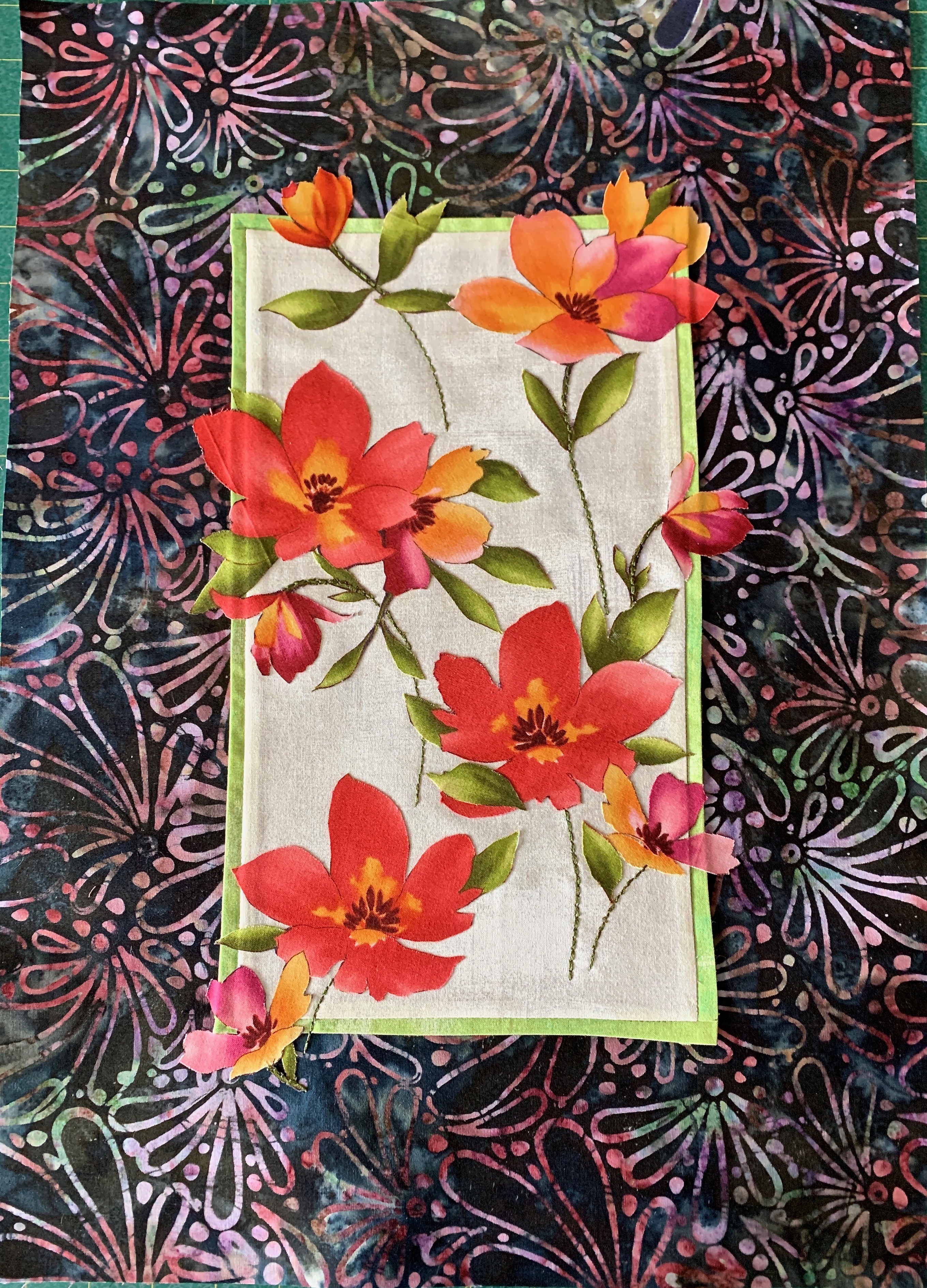
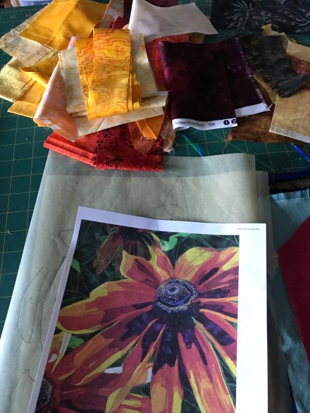
Bubbles

Bubbles!

This is where I am at the moment – 21 1/2″ x 18″. There are four insert circles, the smaller circles are fused raw edge appliqué. Although I’ve ended up with an even number, the distribution and colour feel comfortable.

I’ve been auditioning fabric for a thin inner border and a wide outer border – no luck. Everything I’ve tried – light fabrics, medium fabrics, dark fabrics – all look wrong. I think the piece is telling me to end here and finish with a facing, not a binding!

The next question is whether to quilt or not. I need to do decorative stitching around the appliqué (and possibly outside the inset circles, as well) – I have to wait until I’ve finished the stitching the appliqué to decide.

The point of this effort was to expand my technical know-how – to see how difficult it was to do an insert circle. Definitely not a beginner skill. After five circles, I’ve decided the sewing works best for me with the background on top, just four pins to hold the 3/6/9/12 positions, sewing slowly, one small section at a time, so I can align the opposing curves as closely as possible and still maintain a 1/4″ seam.

I’m not giving up on this idea – I still want to make a table runner and a quilt using it – it’s a matter of deciding whether to use pieced backgrounds, as I’ve done here, or a subtle print/batik throughout. I have to audition some fabric to see what might work.

Inset and Appliqué?

Bubbles?

Four inset circles with appliqué? This is all an experiment. First, the blue background doesn’t add anything – it shows I want to stay with greys, lights and blacks. That block also shows I don’t want pieced circles – I want to use the large prints from my Kaffe Fasset collection – I like the statement each circle makes.

Second, three of those inset circles are not too bad, one is kind of wonky – an appliqué over the wobble would hide the imperfection. Also the piece is stark without the smaller circles – I can’t see trying to inset them, much too difficult – the bigger the circle the easier to inset, I’m finding. I’ve also been moving the circle around in the square, rather than place it at the centre. Will continue doing that.

I also wanted to sew four blocks together and inset a circle at the intersection – there aren’t enough blocks here to try that. I may have to add another couple, making the piece longer, to see whether I can add an inset circle at the intersection. This has become an experiment going in directions I wasn’t expecting.

I have enough here for a fibre wall piece. I want to replace the blue and see what I have . I haven’t nailed down precisely what I want this to be – stopping at this point and finishing the small piece will let me start over.

I’ve been scouring Pinterest for “circle” and seen a lot of very interesting ideas for quilts made with both insert and appliqué circles. I need to review the images I’ve collected and rethink where I’m trying to go with this project.

Circles – A Tentative Layout

Lots Of Circles

I spent much of the morning cutting out circles – 5″, 4″, 3.5″, 3″, 2.5″, 2″ & 1.5″. They still have the fusible web paper on the back, nothing here is permanent yet.

I’ve tried creating a gradient from dark on the bottom right to light on the top left – that seems to be working quite well. I’ve also made the layout denser toward the bottom, less dense toward the top. I’m more or less happy with how this has laid out – next step will be to pin each circle in position.

This is only part of the design – my intention is to do 3-5 largish circular embroideries in strategic spots. I also spent time this morning going through my large collection of embroidery designs selecting circular/floral embroideries that might enhance the quilt further.

These are but a few of the embroideries I have in the folder – I think I’m actually leaning toward the “Freeform Flower” – I have five different versions of that one which may make the final project feel more “modern”. If I go that route, I will have to edit the embroideries for size and likely add a third outline stitching in another colour.

I’m giving myself a day to walk around the circle placement before I fuse them in place and then I will tackle the embroidery challenge.

Found Art – Another Floral Collage

While I was working on “Flowers” I came across a fabric scrap from some zippered bags I’d made and thought the blossoms were interesting, sharply enough printed to allow some detailed thread painting, so I cut out what I could and here’s what I’ve come up with.

Found Art

The previous collage was contained within the framed area. I decided to try a piece that extended the flowers beyond the inner border.

For some reason, the large floral batik seems to complement the colours and after auditioning several pieces for the inner border I finally selected the lime which ties the piece and the wide outer border together. I’ll bind this work with a hidden binding.

So far I’ve stitched in stems to give the collage a bit of flow. Next I’ll do something with the leaves, then finally the flowers. Not sure where a signature will go – I’d intended it to be in the bottom right but I’ve brought the stems too far down leaving me a little short. There are a couple of options – I Have to keep thinking about it.

First Swim – Revisited

It turns out my efforts to represent the shading of the child’s body with layers of differently colored fabric was misconstrued and interpreted as “clothes” by the majority of people who viewed the piece. Very few spontaneously saw him as naked. This was because the contrast between the lights and darks was too great – an artifact of the limited pallet of flesh-toned shades of fabric I was able to assemble.

Original Piece

So I darkened the ligher elements with crayon and wax pastels and stabilized the shading using a hot iron which melts the applied surface wax into the fabric. Now the child is seen as naked.

Child Darkened

I’m much happier with how people are responding.

First Swim – Completed

Here it is – just done:

First Swim


It always amazes me how much finish work goes into one of these pieces – inner border, wide mitred outer border, backing, hidden binding, hanging sleeve. And a lot of it is hand sewing – I’m getting better at hand sewing, but it’s still awkward; I’m having trouble pulling the needle through with my thumb and first finger, especially if I’m trying to get through multiple layers of fabric!

Now to put the art quilting aside for a while and on to making pants.

Rudebeckia

Rudebeckia

I’ve started this appliqué piece from a photo of a large textile art piece by Kate Themel. Mine is going to be small – finished size ~ 9″ 12″. I’m doing it as one of several examples of textile art for a class I’m teaching in June. I decided to use this image because it’s obvious where the colour demarkations are – they are often hard to see when you’re not used to looking at photos for that detail. To emphasize the colour layers I often print my photos (or enlarged photo elements) in black and white so I can distinguish contrasting tones. I will do that in another of the examples to illustrate how that is done.

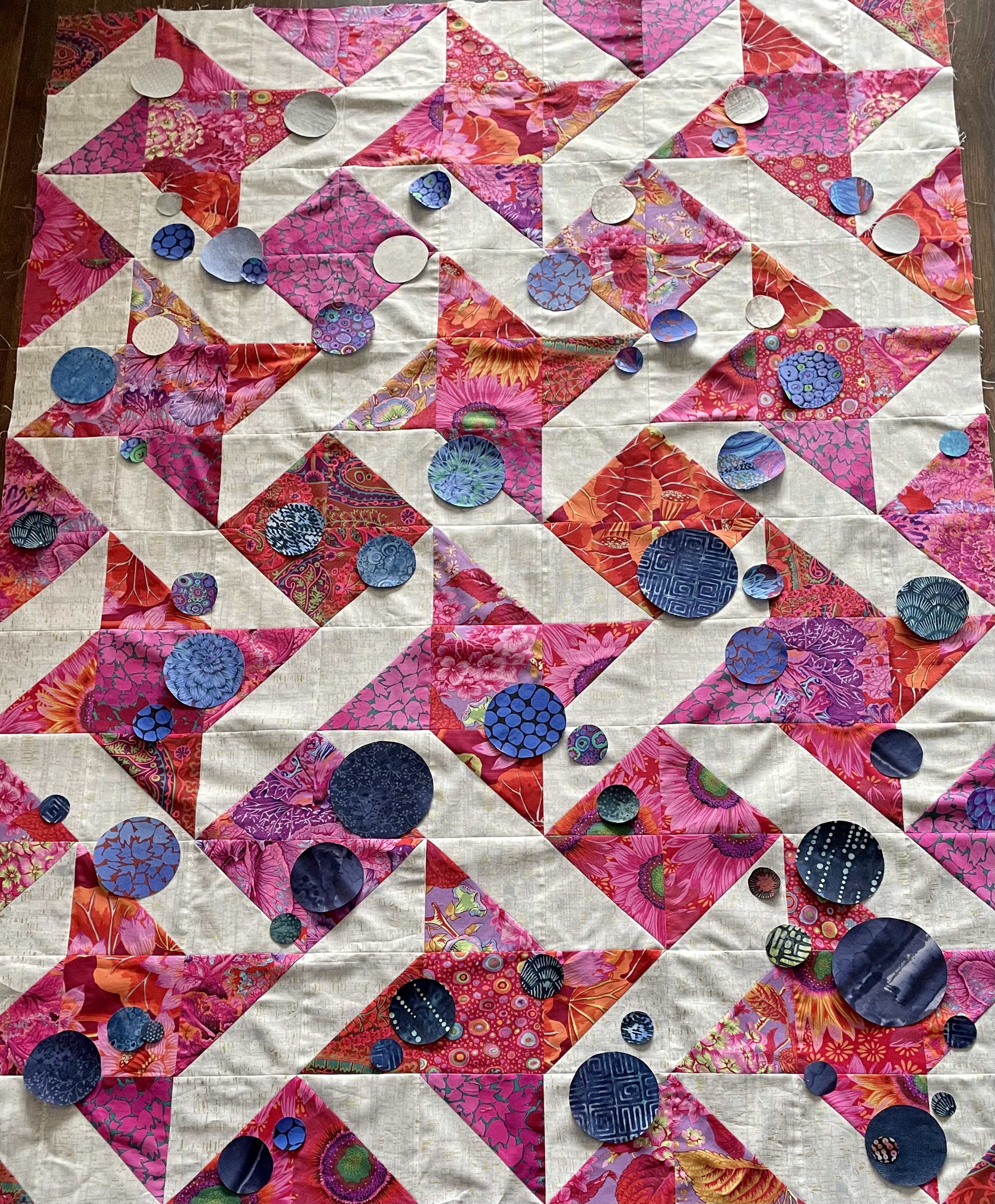
Here, I began by tracing the main image areas thinking about the fabric layers I’d need. Then I pulled lots of scraps from my stash in the range of colours I wanted to use, making sure I had lots of contrast.
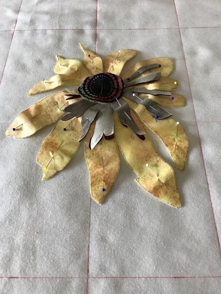
Rudebeckia 1

Next I set up my working background – a piece of muslin 20″ x 26″ (much larger than the finished art piece just in case I might want to add borders, binding…) backed with Warm ‘n Natural batting. I marked both the horizontal and vertical centres, then marked the dimensions for my finished piece, and stitched along those lines. Although the piece has to built from the background up, I focused on the main flower to begin with, cutting out the petals and the darkest accent from templates I created from the photo.
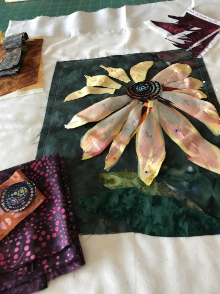
Rudebeckia 2

Next I added a dark background, fused and stitched it in place. I’ve done some dark leaf cutouts which will be fused in position later. At the moment I’m building up the layers of each petal of the main flower – four to go (I’ve kept each template pinned to the fabric so I know where the petals go later when it’s time to fuse the flower in place). I’ve also chosen fabrics for two background flowers which will be darker, less prominent, than the central one.

Before I can add the main flower, however, I have to thread paint the dark background to suggest foliage, then add the background flowers and thread paint them, add leaves and thread paint them, and finally the main black-eyed susan.

The next small example will be based on Peony by Danny Amazonas:
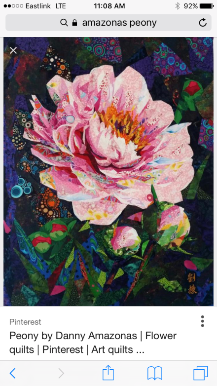
Peony

I’ve chosen this example to illustrate his fused appliqué without thread painting. Again, Amazonas’ piece is quite large, mine will end up a similar size to Rudebeckia – 9″ x 12″, so I won’t be able to include quite as much detail as Amazonas but I will be able to show the building up of the image from background to central focal point.

The example after that will be based on a photo I took a number of years ago:
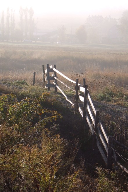
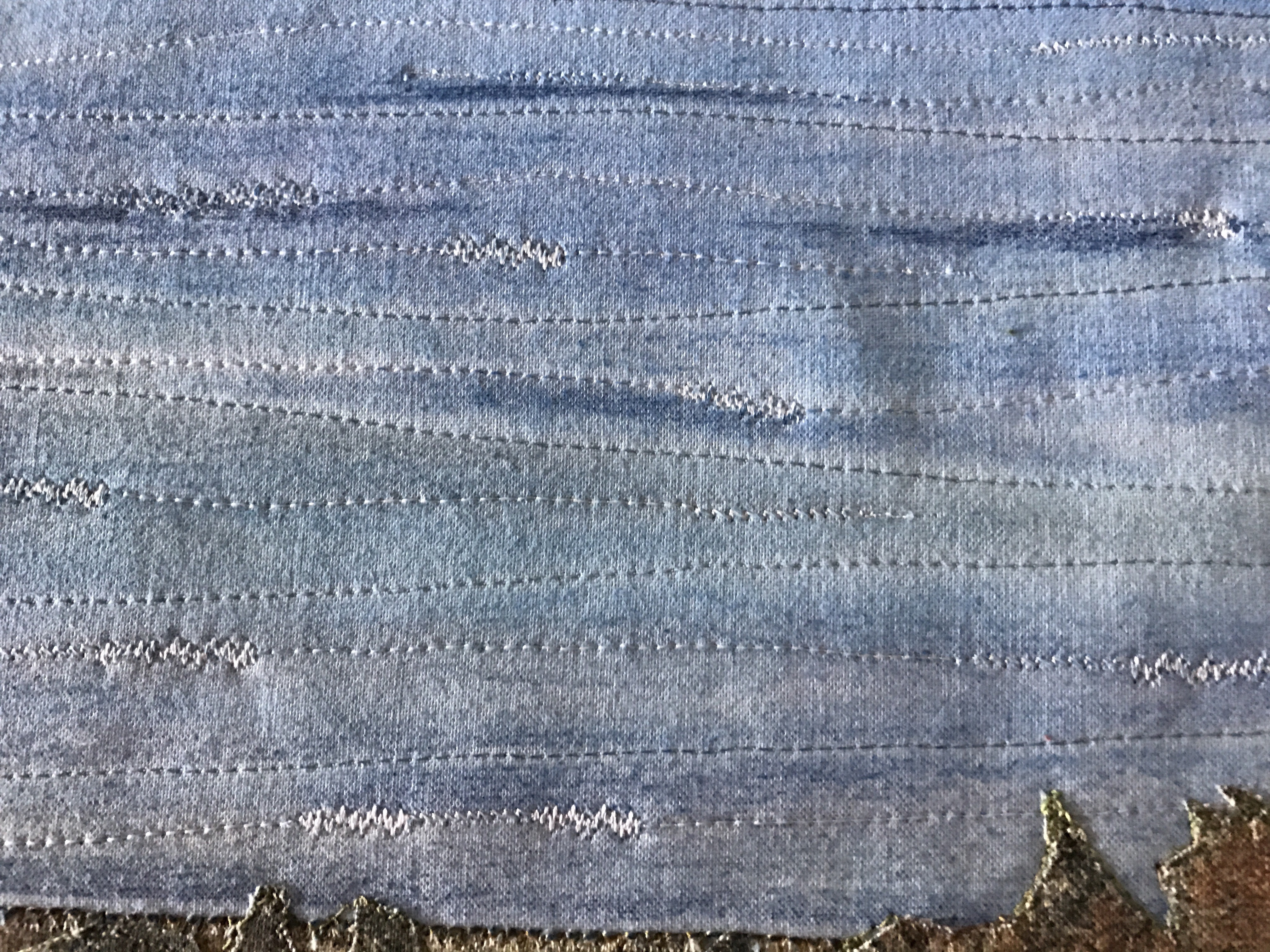
Fence

This piece will illustrate how to create the effect of light by setting up extreme contrasts – the fence rails will be done using off-white fabric, heavily stitched with both blending and contrasting  thread to suggest the shadows. Also I will construct the background at the top of the image using pale fabrics but cover  it with one or more layers of pale grey silk organza to suggest the fog and the foreground will require a LOT of thread painting over carefully fussy-cut layers of fabric.
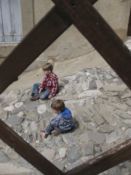
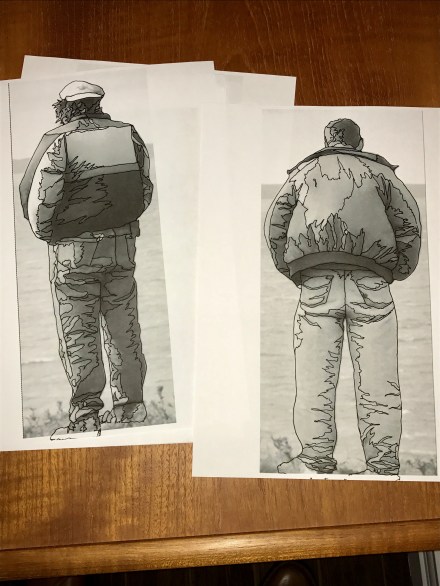
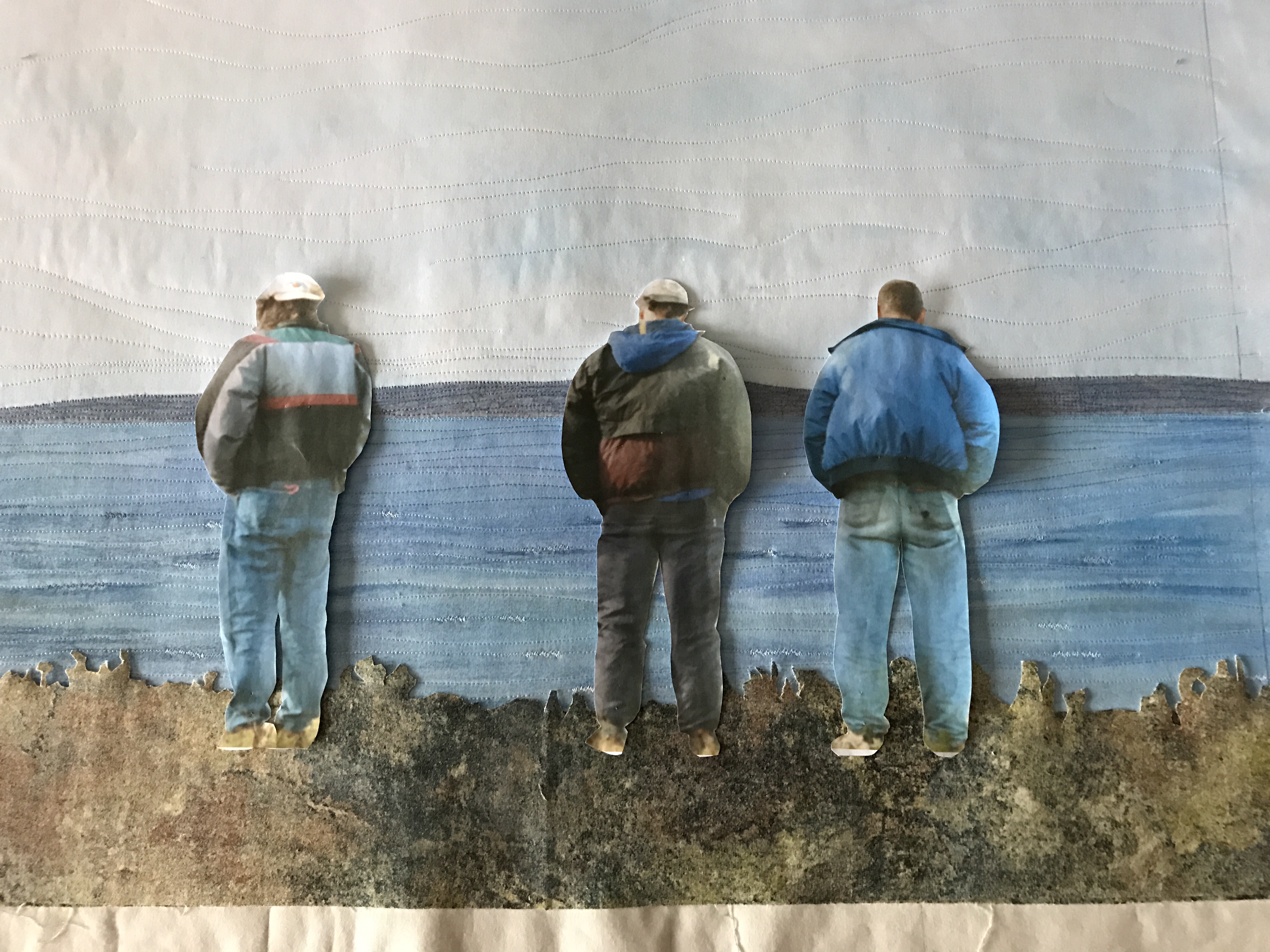
Watching the World

My fourth example may well be based on this photo (with boys positioned to the right rather than the left) to illustrate incorporating photo elements printed on fabric into a textile art piece.

I’ve got my work cut out for me for the next month!

The Solution…

img_8167

Stitched Foreground

Michael Fuller wrote me yesterday

Go with the detail and time consuming fussiness. It’ll be superior to the photo copy model….”

‘OK,’ I though to myself, ‘I’ll give it a try.”

That’s where I started today – I began by printing out the black and white outlined image of Brian, the figure on the left, on some Heat ‘n Bond printing paper in order to use the outlines as templates for the fabric – BUT, here’s a glitch: the technique requires a ton of cutting with small fine scissors and for the last six weeks my arthritic right thumb isn’t working – the muscles to “open” the scissors are too weak to let me cut with any precision.

I decided to try fighting through that problem but a second issue presented itself: I cut out the entire jacket in a light fabric intending to use that as the base and building toward the darker tonal qualities until I had the jacket assembled. I fused some Heat ‘n Bond to the wrong side of my lightest fabric, cut out the overall jacket shape – that worked out OK, but when I started to build the left sleeve it became immediately obvious the slight differences in weight of fabric (although all quilting cottons) was going to create an imbalance and because each tiny piece of the puzzle is so small I would be left with a  slightly fraying “raw” edge in spite of the fact that I’ve fused some Heat ‘n Bond to the wrong side of each small piece before cutting it out.

pilots-detail

Detail of Figures

The final thing that was obvious was how “lifeless” the construction would be. The very subtle differences in shade intensity wasn’t achievable with the fabrics I have.

I gave up after about an hour of finicky cutting and fusing and decided to use the fabric photo images after all and fused them to the background.

What I will do tomorrow is begin the process of edge stitching each figure and then stitching in the colour/shading boundaries. That is also fussy work but my wonky right hand doesn’t interfere with being able to do careful machine stitching.

Here’s The Question…

Pilots: Printed on Fabric

Pilots: Printed on fabric, laid on background

Here’s the question – I’ve been looking at the art piece and wondering how might it look if I printed the figures on fabric, fussy cut them and fused them to the scene instead of trying to create them (shadows and all) from different fabrics?

pilots-detail

Here’s the detail, right? Lots of little pieces to be very fussy cut and fused to a base fabric – very time consuming. Doing the appliqué work will also be time consuming because I will want to stitch in all those colour demarcations, but what I get is a more realistic look to the figures which are the focus of the piece.

All I’ve done so far is print each pilot on EQ Printables Fusible Fabric and carefully cut each. I haven’t yet fused them to the background. The way we see the sun on their clothing gives the viewer a sense of the light – some brightness but not full sunshine. I can’t achieve that through piecing, even if I’m extremely careful with fabric selection.

I guess what I have to do is try one of the guys and see how he turns out – maybe Brian (the one on the left). Whichever way I do this, I think it makes sense to refrain from filling in the grasses/shrubs until after I’ve got the figures in place, that way I can build up the grass around their shoes as I go along and not as an afterthought.

In case you hadn’t noticed – this fabric wall art requires a gazillion decisions and unlike oil/acrylic painting there’s no going back – you have to live with whatever decision you choose to execute.

Experimenting…

Yesterday I worked on the water of the bay. I wanted to suggest the white caps but not to cover the entire surface. I played around with stitches on my sewing machine – several provided possibilities. My machine allows me to modify and create actual stitches so that’s what I did. I tried a couple; in the end I modified the “grass” stitch – I made it narrower and removed several stitches from the single repeat to give me a short burst.

White Caps

Then I used Neocolori Wax Pastels to hint at the roughness of the sea.

Wind Waiting: Current State

It’s all about experimenting with the stitching before actually attempting it on the piece itself. I have just one chance at “getting it right”. Once I start stitching I have to continue, can’t take it out because the needle marks will show, so I try out different threads and stitch settings before actually working on the piece.

Experimenting

Looks a mess, but in my head I can see the effect of each experiment. Underneath are my tests for the water; on top I’m working on the grassy foreground – I need two effects: first, I need to imply the texture and height of the grasses and small shrubs on the bank – that will take the form of rows of horizontal stitching using three or four different variegated threads; second, I want to create a rough edge against the water – the pilots aren’t on the edge of the sandy beach (the landing zone below), they’re at the edge of the bank 89-100 ft. above the water (the launch zone). The edge of the bank, therefore, should show some grasses and twigs against the sea.

Last night I spent a couple of hours modifying some built-in stitches that will hint at that texture. (Once the pilots are constructed and appliquéd in place I will add grasses to cover their shoes because the vegetation at the edge of the bank wasn’t mowed.

So now I have to take a deep breath and start in. This is it!