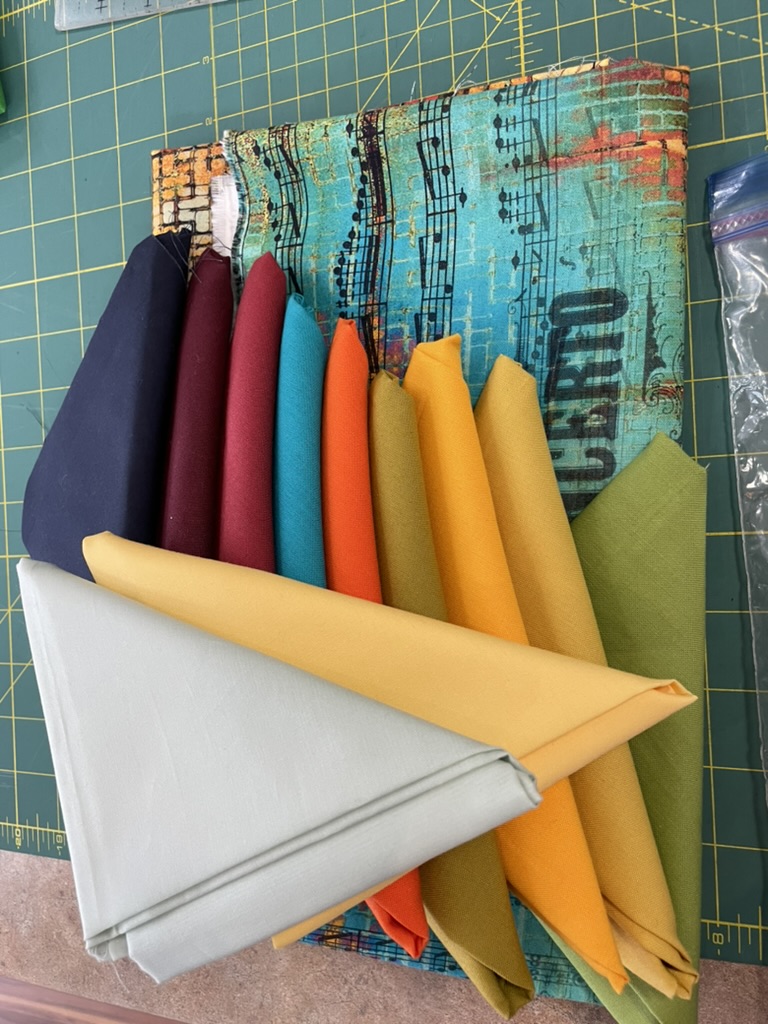
Remember when I started this quilt I had a wonderful bright fabric with yellows/oranges/ turqoises/blues. Because the solids weren’t quite light/bright enough, I added a couple more to liven the array.

I had an idea in my head based on a quilt I’d seen on Pinterest
to use the print as my background, the solids as accents, with the solid triangles formed from three strips.
This afternoon I finally got back to sewing on this quilt (I’ve been avoiding it for over a month). It didn’t take long to sew the strips for the “solid” triangles, pair each strip with a strip of background print fabric, cut the HST.

Each strip pair gave me four blocks – I just needed to lay them out interspersing them with background blocks.
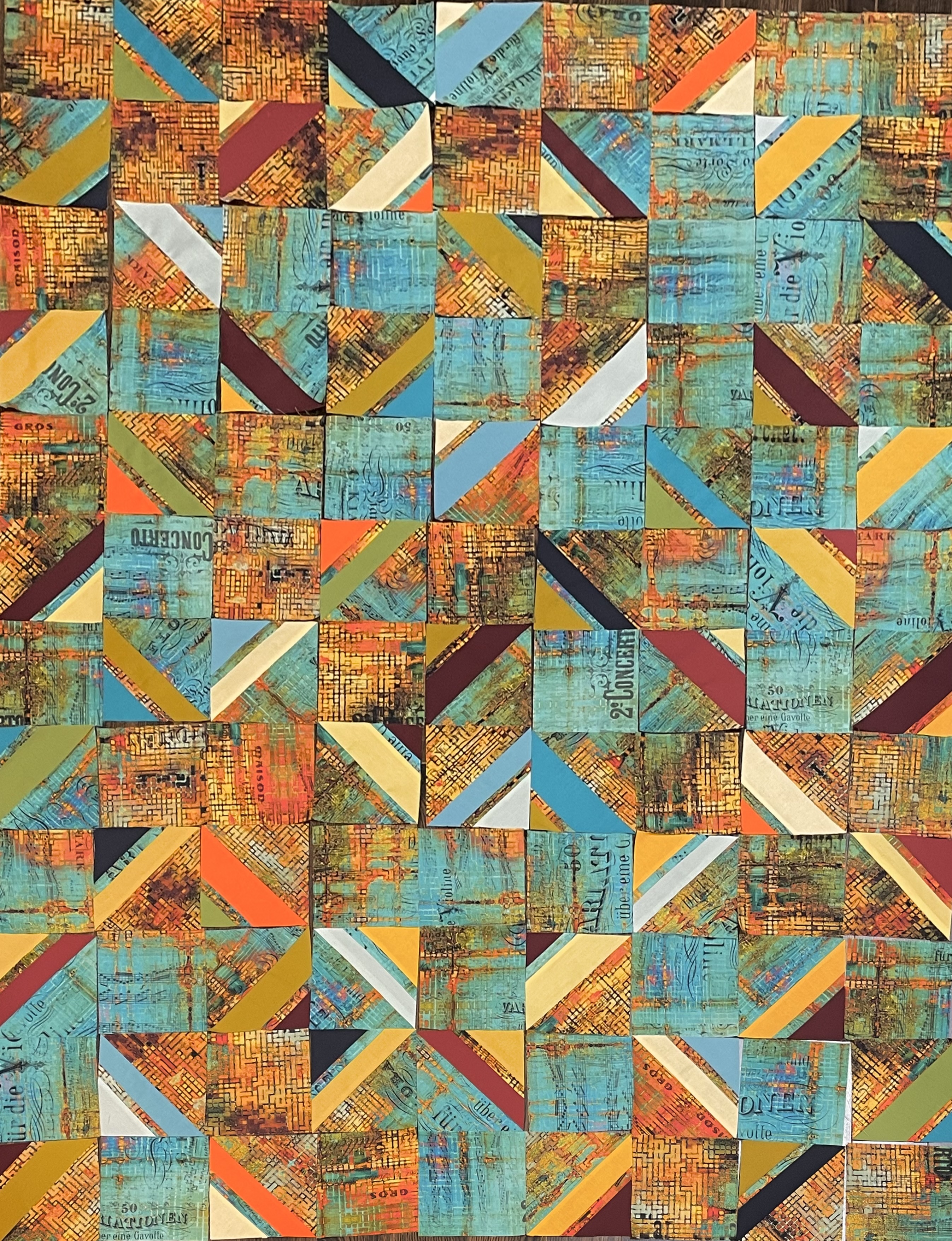
I find it very interesting that when I look at the pieces on my floor the yellows/oranges stand out, but the photo brings out the turquoises/blues! The pale yellow solid elements brighten the ensemble. The pale blues are lost among the music elements of the background. The orange solids, the burgundy stripes connect with the background print (on the floor – not so much in the photo), and the navy doesn’t do much of anything. I’m not sure I see much point in playing around with the layout – I don’t think it will make much difference to this rather drab quilt top.
My challenge now is to come up with some way to make this layout interesting. Would a solid sashing in one of the lighter yellows accomplish that? Use the background fabric for a border? What about circle appliqués (of different sizes) cut from the solids placed in some kind of cascade?
Whatever I do, it will have to involve the solids because that background fabric, which I thought would be striking is so busy when cut up, that it overpowers everything else!
Got any suggestions? I sure don’t know where to go from here.
Since I began working on the project, I’ve had a hunch I wasn’t going to be happy with the outcome. My fallback position was to assemble the array, make it into a quilt (with batting and a backing), then use it to make a jacket! Looking at the potential panel, however, I don’t think the jacket would be outstanding, either.
I hate it when the work goes sideways as it has here.

Sorry, late to the discussion. I would say the issue is about value (bright vs dark) rather than color. Many of the solids you chose are the same value as the background. So they don’t stand out. If you converted this quilt image to black and white, many of your triangles would effectively disappear. Replace all the mid-value solids with lighter or darker colors, and I think the quilt would have more interest.
Trust me, I did that at the beginning before cutting anything! to compare it with
  I’d say three of the fabrics are a similar (mid range) tone; the rest are either much darker, or much lighter. When I matched up the solids I made my choices based on the black and white image! I agree part of the problem is value. The larger problem is that the print is much too busy to be a background, particularly one that is as extensively used as I wanted to use it. Cutting it up only made it busier and the flow of the colour was completely lost. The obverse of the quilt is much more effective
  precisely because I used large pieces of the print interspersed with a limited number of pieced elements. When I go to show the quilt I’m probably going to show the back, not the front. Thanks for weighing in.
Re the “tentative layout,” I love those fabrics together more than anything I can name at the moment. Your fabric choices ROCK!!!
My eye wants to rest on the triangles squares that point to each other with two background squares to make a 4 patch. I think the navy, rust or brown would make a nice sashing in some design. Can’t wait to see what you do with the layout!
I thought through dark navy didn’t even go, but colour picking is not my thing. Gosh, I bought 2 M of this fabric, so I shall be watching with interest to see how it works out.
Don’t know what you do with the fabric, but it isn’t this! Don’t know what I’m going to try.
I’ve been thinking about how you could use the fabric – it would well as a backing making a double quilt. I have quite a bit left (after buying some from a couple of online vendors). I am thinking I will use some to back this effort.
I found a couple of Tim Holtz designed quilts that feature them in big pieces surrounded by muted colours, and it looks good.
Doesn’t surprise me. The print is much busier than I imagined it to be and cutting it into smaller pieces has made it busier. Interesting because I’ve done a bunch of quilts using Kaffe Fassett (and friends) fabrics which are very busy but they’ve worked well. Go know.
You inspired me tonight. I wanted to do a charity quilt before Christmas, and as I was walking, I came up with a quick, easy idea. I wanted to show case the fabric, use only stuff from my stash, and do a lap quilt.
Send pix
I attached it per my usual WP comment action. Hopefully it worked
Scrap petal garden monochrome quilt might be up your alley.
Ya, right!
Did you look it up?.
I did. Ok to do it as an appliqué – I’m not up to actually piecing it!
I agree that this didn’t come out the way you’d hoped. I lean to using more of the dark navy — it alone pulled my eyes. Maybe sashing…maybe a shape on its own somehow (star shaping?)
Good ideas to think about!