I spent the weekend in Parrsboro doing a workshop learning to work with Cyanotype:
The cyanotype process uses a mixture of iron compounds, which when exposed to UV light and washed in water oxidise to create Prussian Blue images. The technique was invented in 1841 by Sir JohnHerschel and was popularised by photographer and botanist Anna Atkins. Her book ‘Photographs of British Algae: Cyanotype Impressions’, published in October 1843, is considered the first photographically illustrated book.
https://parallaxphotographic.coop/how-to-make-cyanotypes/

The process starts by coating a good quality acid-free watercolour paper (or other paper like tissue paper) with a UV reacting iron salts solution (which is nearly clear), hanging it to dry in a relatively dark (non UV) spot, when dry arranging objects on it, then exposing the layout to sunlight until the wash become a brownish grey at which point you rinse the image in a water bath (with a couple of capfuls of vinegar) until the “yellow” unexposed parts become reasonably “white”, then rinsing it in a second bath with a bit of hydrogen peroxide to fix the blue – the cyanotype.
Sounds easy, not so much. The quality of the paper matters, the accuracy with which you combine the solutions used in the coating, how you apply it, the amount of light where the paper dries, whether you’ve managed to keep it in a dark place after it’s dried – those are some of the technical variables that affect image outcome.
Then comes composition. My first inclination was to use quite a few different objects of varying transparency layered on one another –
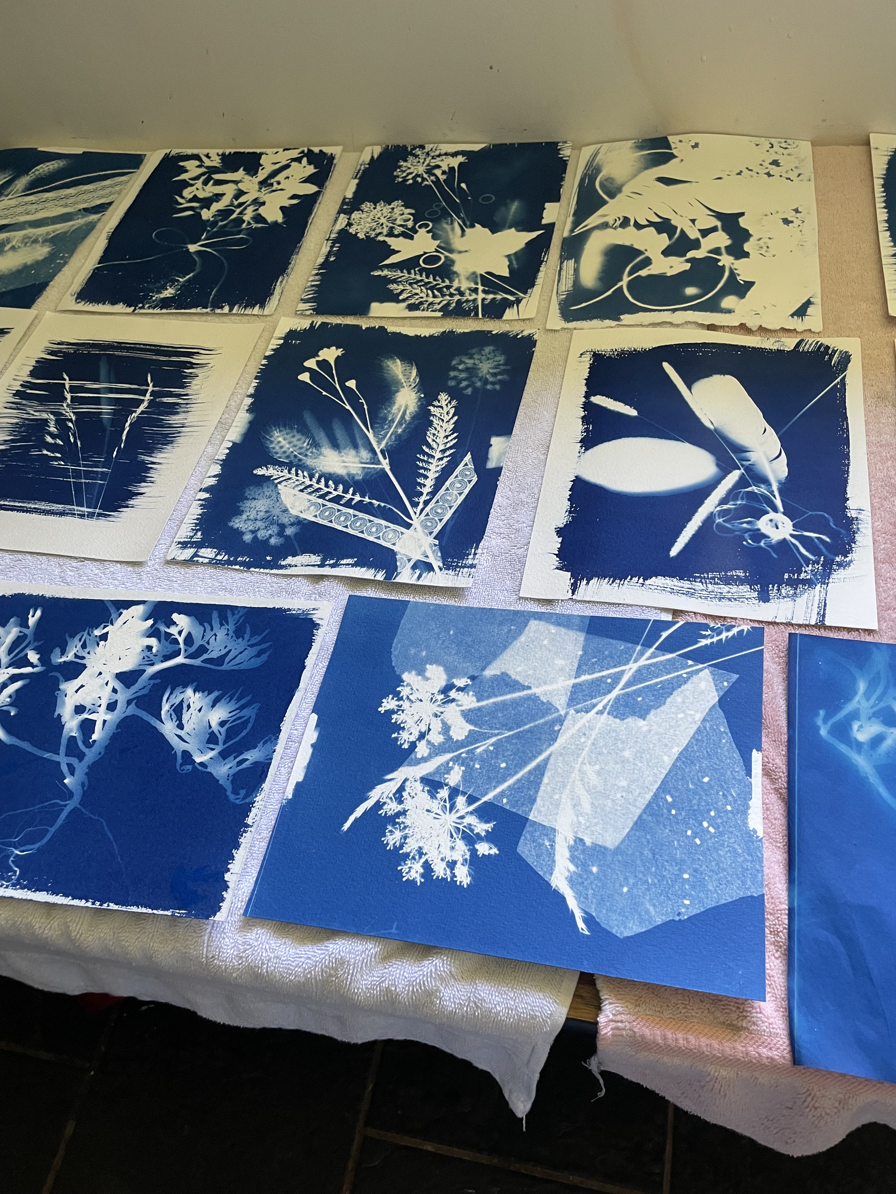
I’d raided my sewing supplies and brought all kinds of lace, sequins, tissue paper (with glitter), feathers, beads, knitting stitch markers…. all of which would blocked sunlight. I tried arranging wildflowers and grasses with these inanimate items only to discover the rings/tissue paper/lace all blocked the sun more effectively leaving much stronger white areas on the image detracting from the “subject” – the wildflowers!
I also placed all of my objects beneath a layer of glass (primarily to keep the lighter items from being moved by the wind – because you need a relatively long exposure time – 3-5 minutes (maybe longer – it’s subjective). The first thing I realized was that maple leaves/lace, placed under glass blocked too much UV light. I was going to have to experiment with placing those objects on top of the glass and removing them part way through the exposure. By the end of the afternoon I also understood I really wanted fewer items so I could highlight a definite subject. Hence the trials on the second day.
On the first day we used a high quality paper supplied to us. Second day, I used watercolour paper I had brought (not so good) – it reacted with the coating solution differently than the better paper and the resulting image had less contrast.

Next I experimented with objects under glass vs items on top –
The print on the left is an impression of a Moth Mullein – delicate petals allowing light through, you can see where they overlapped. Further down the stem are finished flowers which are much denser, hence they blocked more light. At the bottom of the image you can just detect a “card” with holes – that was placed on top of the glass at the start of the exposure, but removed about half way through.
The print on the right – another Queen Anne’s Lace and a sprinkling of glitter below the glass, some leaves (don’t remember what they were from) placed on top, then removed – which gives a better balance to the image.
I was also interested in allowing the brushstrokes to show rather than completely coating the paper giving the image an unfinished organic feel.
I learned a lot. I had hoped to try fabric for some cyanotypes but it has to be prepared differently (washed in a non-calcium containing detergent, dried – then soaked in the iron salts solution (somewhat different proportions), dried again, before the pieces can be exposed. I had thought I’d do some fabric blocks to embellish with appliqué and thread painting but I would have difficulty doing this at home I realized – I get very little direct sunlight on my balcony (I get an early morning sun at a low sky angle until just before 10:00am at midsummer); to work on my friend Deb’s patio of an afternoon to get a higher sun means I’d have to set up the developing wash basins in her kitchen (trying to darken the room, not to expose the paper/cloth further) before rinsing and fixing. All a lot more complicated than I think I want to bother with.
But you never know.

Pingback: Clematis | jmn
It’s always cool to try new things. I just usd acrylic paint on a weaving to create a background.
How’d it turn out?
I am quite pleased with it. Still a way to go before the project is completed.
Beautiful
You going to get to see the quilts?