When I look at the current election map of the US I am mystified by the enormous red expanse. I’m supposed to believe that the US is almost entirely Republican:
 Normal Vote Representation by State
And then I came across this map showing population density – now the election results make some sense! People in the US are clustered on the coasts and in a few central locations – and the vote distribution is clearly more equal:
 Vote Map By Population Density
I came across the map in a tweet by Sarah Cooper and then tried to find out more.
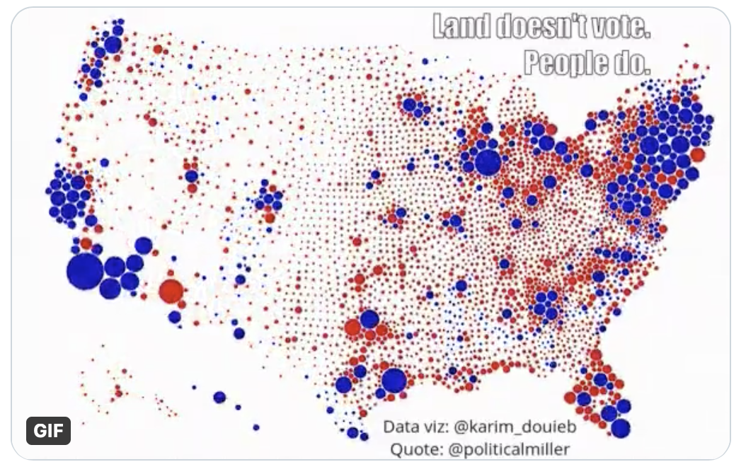
“Land doesn’t vote. People do”
Here is the visualization by data scientist Karim Douieb:
Data scientist Karim Douïeb figured that a more accurate way to represent how people voted is to use colored dots, varied in size proportionally to the population of each county. He turned the results into this GIF, which provides a clearer picture:

Pretty eye-opening, no? And yet, while this is clearly an improvement over the ham-fisted method of the first map in this entry, even this is not quite accurate. Within each of those large blue dots, you still have plenty of people who voted red, and vice versa. These results only show you which party won the vote in each region.
What do you think we’d see, if these data represented actual individual votes and we could zoom in on each one? The country is now more divided than ever, and just about evenly split. So all I’m certain of is that zooming out, we’d see a perfect shade of purple.
I guess it’s important to think more deeply about the mundane.

This is very well done.